


Stealth Taxes Consume Stock Gains & Retirement Plans, Part 1
by Daniel R. Amerman, CFA
Why is there a fundamental mismatch between stock market performance as reported in financial headlines – and the actual retirement behavior of the many millions of Americans who own those stocks in their portfolios?
Using 15 years of stock market performance data and the type of analysis tools used by sophisticated wealth management professionals, we will solve that mystery in this research-based tutorial. The results may come as a major surprise, even for well read and financially literate investors who have been buying stocks for decades.
On the one hand, stocks have been in a sustained rally, with the markets recovering from the depths of 2008 and 2009 and finally moving on to all new highs. This should have created enormous wealth for tens of millions of long-term retirement investors who have stock-heavy investment portfolios in their retirement accounts.
Yet at the very same time, according to recently released government data as reported in Bloomberg and the Washington Post, the fastest growing group of workers in the United States is older than age 65, up 67% in 10 years, and their average weekly pay has climbed from $502 to $825 over that time.
Over a decade, there has been a three-part change in behavior among those aged 65 and older, with a reduction in the percentage of those retiring, an increase in full time work rather than part time work, and incomes that are higher than those of all workers on average. So people with higher wages than the rest of the population are not only not retiring, they are increasingly not slowing down either, but are continuing full time jobs.
Now where the mystery comes in, is that people who are older than 65 with successful careers and good incomes are the exact same people who would be expected to have substantial stock portfolios in their retirement accounts. So if stocks have in fact been creating so much wealth in recent years, why is it that the same segment of the population that owns the largest amount of those stocks are in practice the same group that is changing their retirement behavior in order to prolong their careers and keep their full income coming in?
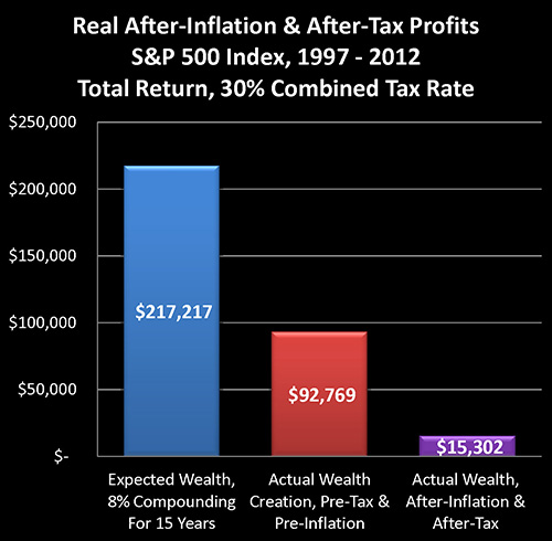
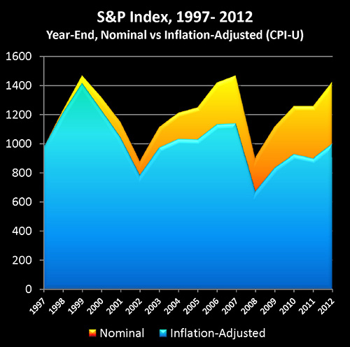
The explanation of the mystery can be found in the graph above, which is based upon historical performance of the Standard & Poor's 500 index from the end of 1997 through the end of the 2012, as well as official US government inflation statistics for those same 15 years. As such, the graph should act as a reasonable proxy for the real world long term performance results achieved by tens of millions of American investors during those years.
Based on an assumed starting portfolio value of $100,000, the blue bar reflects expectations for the compounding of wealth through stock investment. It assumes an 8% average return – which has been a quite common assumption, particularly 15 years ago.
The red bar shows actual real-world performance on a total return basis, with price movements in the S&P 500 index, dividend payments and the reinvestment of dividend payments. It is much lower than expectations, but still substantially positive.
The purple bar shows what really matters – the purchasing power of average stock market investments on an after-tax and after-inflation basis. As shown above, in the real world for many millions of investors, the purchasing power of long term stock market profits has been virtually non-existent. If we compare what really matters – which is what money will buy for us on an after-tax basis – then real gains are a mere 7% of expected wealth gains.
The purple bar is what reconciles the mystery, and explains the divergence between the headline illusion of major profits and the reality of actual after-tax purchasing power in retirement that is currently driving the behavior of millions of investors.
As we will explore, the ultimate bottom line number of what our investments will buy for us after we've paid our taxes has been dominated by something that few average individual investors fully understand, which is the powerful and deceptive relationship between inflation and taxes.
What may come as a particular surprise is that these dramatic results are entirely based upon the officially reported 2.42% average rate of inflation over the 15 years. If our personal experience with increases in prices leads us to suspect a higher real inflation rate, then real world performance becomes even worse than what is shown herein.
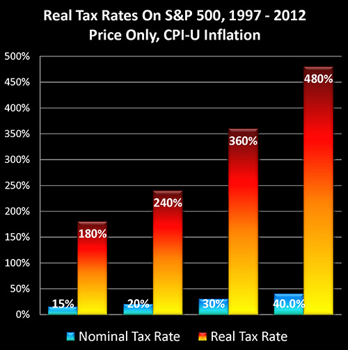
As shown in the above graph, inflation creates "Stealth Taxes" on stocks, which are far higher than stated tax rates, and which slash real after-tax stock returns. These hidden taxes aren't a line item in either brokerage statements or tax returns, but they have in fact consumed much of the purchasing power of long-term investment profits – and retirement plans – for an entire nation.
Three Levels Of Illusion
When it comes to long-term stock performance since the late 1990s, while paper gains may look impressive, there are in fact three levels of illusion, as covered in three interrelated articles of mine. This is the third article in the series, and can be read on its own without having read the other two, but the complete picture can best be seen when all three are considered together.
The first level of illusion has to do with real price gains. And as explored in, "How Financial Reality Is Hidden By Commonly Used Theory And Jargon", in point of fact when it comes to the two largest components of net worth for US citizens – stocks and home values – real changes in price levels have been negative for the 22 out of 40 years studied between 1972 and 2012.
http://danielamerman.com/articles/2013/JargonD.html
The second level of illusion is discussed in "Creating Wealth With Stocks: Expectations Versus The New Reality", which is when we look at the long-term compounding of wealth in the stock market since the end of 1997, while on the surface the results look reasonably good, the bottom line was actually a failure to deliver 65% of the results that were expected by long-term investors as well as pension funds.
http://danielamerman.com/articles/2013/StockWealthD.html
Having two thirds of their expected pre-tax wealth gains go missing for 15 years in the critical later years of their working career is, in reality-based terms, a major explanation for why so many people are no longer retiring when they had expected to, despite decades of disciplined savings and investments.
The third illusion has to do with what real tax rates are on after-inflation income.
To understand what is happening, let's begin by taking a look at the graph and chart below for the Standard & Poor's 500 between the end of 1997 and the end of 2012.
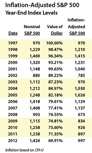
The Standard & Poor's 500 at the end of 1997 had a value of 970, and by the end of 2012 had reached a value of 1426 (as shown in yellow), which was in nominal terms a quite impressive gain of 47%. However, once we adjust for changes in the purchasing power of the dollar, then using official US government inflation statistics (the CPI-U as calculated by the Bureau of Labor Statistics), a dollar by the end of 2012 would only purchase what 69.9 cents would have purchased 15 years before. So when we take our ending index value of 1426, and we adjust for the change in purchasing power, our ending purchasing power is only 997 (as shown in blue), or a gain of 27.
Out of what appears to be a 47% gain, then, once we adjust for the changing purchasing power of the dollar, only 2.7% of the gain turns out to be real. And the remaining 44.3% was really just illusion in the form of inflation. We basically just maintained our purchasing power and came out a slight bit ahead. (The previously linked "How Financial Reality Is Hidden By Commonly Used Theory And Jargon" has much more on this illusion.)
However, even though it is governmental monetary and fiscal policy that creates inflation, the Internal Revenue Service does not recognize the existence of inflation when it comes to taxes on investment gains.
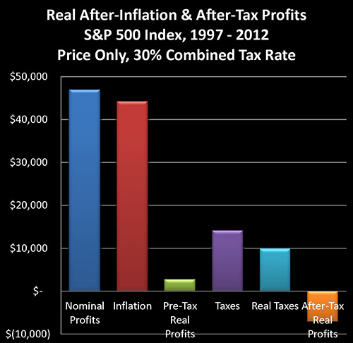
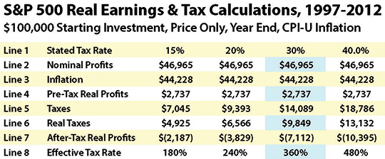
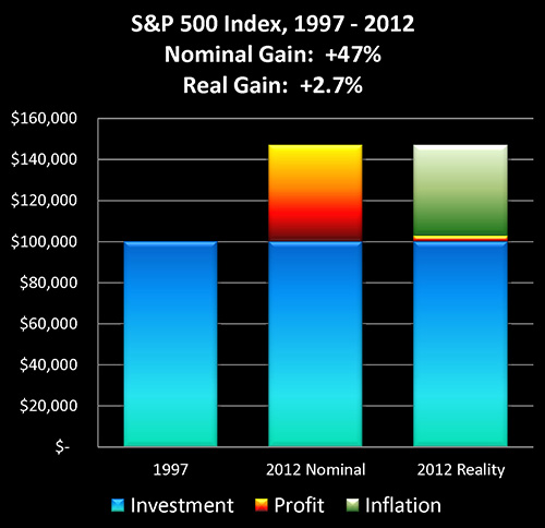
Assuming we started with an initial investment of $100,000, if the stocks in our portfolio performed exactly like the stocks comprising the S&P 500, then on a price-only basis our ending portfolio value would have been $146,965. Subtracting the initial investment leaves us with $46,965 in profits, as shown in the dark blue bar on the above graph and line (2) on the chart.
When we take the declining purchasing power of the dollar into account, it turns out that $44,228 of our "profit", is really just keeping up with inflation. (The red bar and line 3.) To find this number we start with our ending portfolio balance of $146,965, and we adjust for inflation by multiplying by 69.91%, for an end result of $102,737, which is the real value of our portfolio in inflation-adjusted dollars, with the difference between $146,965 and $102,737 being $44,228.
After adjusting for inflation, we find that our real profits (pretax) are in fact only $2,737, as shown in the green bar and line 4. (We can derive this number by either subtracting the inflation number in line 3 from the nominal profits in line 2, or simply by taking our ending $102,737 inflation-adjusted portfolio value, and subtracting our initial $100,000 investment.)
The four right-hand columns in the chart are for varying tax rate assumptions, on a combined state and federal basis. We will be using the assumption of a 30% tax rate for this walk-through.
Now even though inflation is caused by the government through a combination of fiscal and monetary policy, the Internal Revenue Service does not recognize inflation as a deduction. Therefore, it treats the entire $46,965 shown in line 2 as being taxable income. When we apply a 30% tax rate (assumed combined federal and state marginal rates) to this, we come up with $14,089 in taxes due, as shown in line 5, as well as the purple bar of the graph.
Because we are looking at real profits in inflation-adjusted terms (the value of the dollar at the end of 1997), we need to also look at taxes in terms of 1997 dollars in order to keep an "apples to apples" comparison. Multiplying the 2012 taxes by our inflation deflator of 69.9%, gives us real taxes of $9,849, as shown in line 6 and the aqua colored bar.
When we subtract these inflation-adjusted taxes (line 6) from our inflation-adjusted income (line 4), we find that the real after-inflation and after-tax bottom line is a loss of $7,112. On a reality basis, then, we didn't make 47% – but rather we lost 7% of our original investment.
A 100% income tax rate on real (after-inflation) profits would have taken our entire 2.7% in real profits, leaving us at breakeven. With a 7% loss, however, we did worse than break even. Therefore, our real tax rate must actually be higher than 100% of our real income.
When we divide real taxes (line 6), into real income (line 4), we get the real tax rate on real income. For our 30% tax rate example, then, we divide $9,849 in inflation-adjusted taxes by $2,737 of inflation-adjusted income, and perhaps to our surprise, we find that our real tax rate is 360%, as shown in line 8 of the chart, and also illustrated in the graph above.
As further shown in the chart and graph, for the 15 years analyzed and looking at actual price changes in the Standard & Poor's 500 index, a 15% stated tax rate translated into a real tax rate of 180%, while a 20% stated tax rate translated into a 240% real tax rate, and a 40% marginal (federal and state) stated tax rate became a 480% real tax rate.
Fully taking inflation and stock index price changes into account, the real impact of the increase in the long-term capital gains tax rate in the United States wasn't to go from 15% to 20%, but rather from 180% to 240%.
The real tax rates may look fantastically high when compared to stated tax rates, but the source is easy to see – once we know what to look for. Simply return to our "Real After-Inflation And After-Tax Profits" graph and visually compare the towering size of the red "Inflation" bar, to the thin little sliver of the green "Pre-Tax Real Profits" bar.
It's not just that impressive looking price gains were almost entirely based on the destruction of the value of the dollar hiding miniscule real returns, but worse – that illusion of income is fully taxable. The red bar in the graph above is every bit as taxable as the green bar. And once income taxes are paid on the towering phantom income of inflation, the result is that all of our real income was taken by the government, and a great deal more besides.
So when inflation-based "profits" widely exceed real profits, there is a compounding effect on real tax rates that greatly exceeds the stated increase in tax rates. Which is why real capital gains tax rates rose by 60% for the period analyzed, rather than the stated 5% increase.
If financial reality is defined (as it should be) as what our investment profits will buy for us after we've paid our taxes, then for the 15 years analyzed – reality simply hasn't been working the way most investors think it has been.
Testing The Results
Most investors have likely not seen their stock performance analyzed in the precise manner shown above. Some aspects are indeed a bit unusual, but the reason for this approach is to help foster a clearer understanding about what has been happening in practice for many millions of investors.
There is also a simpler – and irrefutable – method of confirming the results. If we start with $100,000, and we buy the S&P 500 at 970, and we sell it at 1,426, then our ending portfolio is $146,965 (leaving out rounding).
Thirty percent taxes on $46,965 in profits equals $14,089, which leaves us with an after-tax portfolio of $132,875.
Adjust for changes in price levels per the CPI-U, and at the end of 2012 the dollar would only buy 69.91 cents when compared to what it would buy at the end of 1997.
Multiply our after-tax portfolio of $132,875 times 69.91%, and clearly and unmistakably, the after-tax and after-inflation value of our portfolio is $92,888, which is a loss of $7,112 in purchasing power, precisely as calculated above.
By just doing this basic math, the appearance of a sweet 47% profit turns into a 7% loss in what we can buy after we've paid taxes. And this same math very much applies in the real world to millions of investors,
The root of the problem is that people don't understand the underlying relationships. Millions of people have a very solid basis for believing they have made a nice profit over the years. Yet in the real world, those millions of people are simultaneously finding out the purchasing power of their successful investment portfolios turned out to be much less than they hoped it would be.
Understanding the relationship between inflation, real returns and taxes is essential if we are to have a chance at building real wealth. Hopefully this walk-through has provided some insights into what may have been going on "under the hood" with your own investments since the late 1990s.
An "Optimistic" Analysis?
The bottom line of this analysis may look a little bleak, though one might hold out hope that in their individual experience they actually fared much better than that.
Unfortunately, however, whereas the analysis assumes a performance that was exactly even with the overall market – long-term studies of actual investor results indicate that most people have done even worse than what has been shown.
Basic human psychology is that most of us tend to buy investments when we see prices rising, and sell investments when we see prices falling. Even a slight tendency over the years to "buy a little high" and "sell a little low" can be problematic, given that the way to beat market averages is the opposite strategy of buying low and selling high. This human nature-based tendency skews down average investor performance, meaning that most people who invested in S&P 500 stocks during the 15 years shown didn't do quite as well as the average results shown.
Another issue has to do with inflation perceptions and inflation statistics. Most people when looking at officially reported inflation statistics for the 15 years analyzed – which per the Consumer Price Index show an average annual rate of inflation of 2.42% – would likely say that inflationary fears were greatly overblown, and that inflation turned out to be a non-issue for investors.
Arguably, the reason for this common belief is that relatively few investors see the world in the way that is mathematically explored herein, which is an intertwined world of inflation, real growth and real tax rates.
Inflation could be called the "father of all lies" when it comes to investments and economic statistics. As covered in my previously linked article "How Financial Reality Is Hidden By Commonly Used Theory And Jargon", the two most common ways in which inflation is presented are each inherently deceptive, covering over the truth rather than exposing it.
The negative effects of being unaware of inflation's true impact is greatly exacerbated by the subtle power of the mathematical relationships, which seem to violate common sense. A 2.42% rate of inflation seems like it should be very minor, with little impact on a plainly obvious near 50% surge in stock values. The adjustment for inflation seems like it ought to be a technical footnote, rather than dominating the bottom line.
Reality is, however, that even a relatively "minor" rate of inflation is sufficient over time to turn 47% profits into 7% losses – simply through viewing investment results in after-inflation and after-tax terms.
A still bigger issue comes when we understand that the methodology which the government uses for calculating inflation rates has changed quite a bit in recent decades. Current calculations lead to lower reported inflation rates than the old methods.
And if the prices that you've personally been paying for food, gasoline, health insurance, college tuition for children, utilities and so forth seem to have been rising at an "old-fashioned" rate of inflation rather than the 2.42% derived in using more recent calculation methodologies, then there is a huge impact on these results. There are no real profits at all, and the amount of starting net worth lost to the government in purchasing power terms grows much higher.
Another crucial issue is that for purposes of simplicity and conservatism, we have ignored financial fees. Investors who have to pay fees in practice and are not able to ignore fees for theoretical modeling purposes, would experience worse financial results in the real world than those shown herein.
Investor Implications
For most investors, there are two major implications for what has been covered in this article.
The first implication is that most investors face a daunting challenge in the years ahead. The results presented herein reflect real-world results for an entire nation over a 15 year period. Even if we assume that economic growth and corporate profit growth are each positive in the years ahead (so we're not talking a bleak economic future), but they're not as strong as they were in the late 20th century, and if we see inflation at even historic norms (so no hyperinflation) then on a national basis, investors will likely still have a serious problem.
Stock indexes would continue to rise, with widespread financial headlines trumpeting the good news at each stage. Yet, for millions of investors, as they consider when they can afford to retire and what their lifestyle in retirement would be, the bottom line of what they can buy with after-tax dollars is all too likely to continue to be a major disappointment.
If tax rates have another round or two of increases – as a nation struggles to deal with the costs of exponentially growing retirement promises, high debt levels and persistent high real unemployment – then as a mathematical necessity, the real bottom line of after-tax purchasing power will grow much worse, even as the "mystery" for millions of investors will continue to deepen.
The second implication is that a daunting challenge may in practice turn out to be an impossible challenge for millions of investors if they can't see with clarity what the real challenges even are.
That said, while fighting the combination of potentially lower growth rates, persistent inflation, and potentially rising tax rates may be difficult – there are solutions. However, the strategies used to fight these stealth taxes are quite different than conventional strategies, which are based on completely ignoring these taxes. And the only way to effectively protect oneself is to stop ignoring them, and thoroughly understand what is happening.
In other words, education is the first step. Hopefully this research-based tutorial has been helpful in that regard.
In Part Two we will continue our exploration, as we build in 15 years of historical dividends and the reinvestment of dividends, while taking our understanding to the next level.
 What you have just read is an "eye-opener" about one aspect of the often hidden redistributions of wealth that go on all around us, every day.
 A personal retirement "eye-opener" linked here shows how the government's actions to reduce interest payments on the national debt can reduce retirement investment wealth accumulation by 95% over thirty years, and how the government is reducing standards of living for those already retired by almost 50%.
 An "eye-opener" tutorial of a quite different kind is linked here, and it shows how governments use inflation and the tax code to take wealth from unknowing precious metals investors, so that the higher inflation goes, and the higher precious metals prices climb - the more of the investor's net worth ends up with the government.
 Another "eye-opener" tutorial is linked here, and it shows how governments can use the 1-2 combination of their control over both interest rates and inflation to take wealth from unsuspecting private savers in order to pay down massive public debts.

If you find these "eye-openers" to be interesting and useful, there is an entire free book of them available here, including many that are only in the book. The advantage to the book is that the tutorials can build on each other, so that in combination we can find ways of defending ourselves, and even learn how to position ourselves to benefit from the hidden redistributions of wealth.