Chapter 19: Using Gold & Stocks As Contracyclical Assets, Six Stage Analysis Of A 5,000 To 1 Advantage
by Daniel R. Amerman, CFA
TweetExtraordinary stimulus spending by the U.S. government and massive monetary creation and spending by the Federal Reserve may be enough in combination to end the coronavirus recession in the next year or two.
But, they may not. If the 3rd round of the containment of crisis fails, then the results of the pandemic and economic lockdowns could include a long and severe recession - or even a depression - and a potential secular (long term) bear market in stocks.
If this were to happen, then history shows that gold has far more valuable uses than if it were just a mere inflation hedge. In this chapter, using six stages of analysis, we will explore a powerful and highly consistent historical relationship between gold and stocks that offers investors the ability to use gold in ways that far exceed the profits produced by just attempting to keep up with inflation.
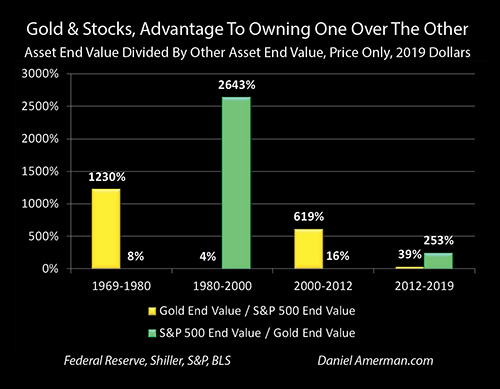
The graph above shows the results of four choices between investing in gold and investing in stocks over the period from 1969 to 2019. What is compared is the ending after-inflation financial advantage of holding one asset over the other (price only), between gold and stocks (as represented by the S&P 500). These are secular investments - it is a long term relationship, not a day trade or even an annual trade.
The first eleven year cycle included the stagflationary decade of the 1970s. It was a very good time for gold – and very bad time for stocks, particularly in inflation-adjusted terms. Using annual average prices for gold and stocks, if someone had owned gold that entire time period (no interim trading), then on a price basis, they would ended up with 12X the money than what they would have had if they only owned stocks.
The next long cycle of 1980 to 2000 strongly favored stock ownership over gold. Using annual average prices, if someone had bought stocks in 1980 and owned them through 2000, then they would have ended up with 26X the assets of someone who owned gold for those two decades.
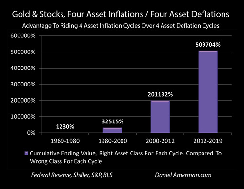
If we combine the two holding periods, then someone who owned gold from 1969 to 1980, and then stocks from 1980 to 2000, would have ended up with 325X the assets (based on price changes only) of someone who owned first stocks, and then gold over the same time periods. That is an astonishingly powerful long term relationship – if a 40 year old had made just two investment choices between two huge asset classes over 31 years, one in 1969 and the other in 1980, and done nothing else over those years, then at age 71 in the year 2000 they would have literally had over 300 times the money than if they had made the two opposite choices.
It is not just those two cycles, either. If a 50 year old had chosen stocks in 1980, and then gold in 2000 (annual averaging in and out), then when they were 82 years old in 2012, they would have had 163 times the assets than if they had made the two opposite choices.
The historical numbers over 50 years are that if a 30 year old had bought gold in 1969, switched to stocks in 1980, switched to gold in 2000 and switched to stocks in 2012, just those four investment choices - being completely passive all the rest of those years with national average results in each year – then price changes alone would have produced more than a 5,000 to 1 advantage in the money they would have had at age 80 in 2019, compared to if they had made the four opposite choices.
As developed in the six stages of analysis below, what the last half century shows us is that gold’s greatest value is that of being a secular, contracyclical asset to stocks, as well as a general counterbalance to economic risks, financial stability risks, and monetary stability risks. This rare degree of contracyclical performance from a physical, non-financial asset is many times more valuable than gold’s value as an inflation hedge, and this is particularly true during volatile times, such as those we are currently experiencing.
Once this relationship is understood, then the combination of 1) the historical consistency of the secular cycles; with 2) the historical magnitude of the contracyclical yield swings between the two asset classes; means that 3) there are numerous ways of using this relationship on a long term basis to increase returns, or to decrease risks – or to do both at the same time using hedging strategies. These powerful enhancements can apply to those who primarily prefer gold, they can apply to those who primarily prefer stocks, and they can also apply to those who are indifferent to the asset classes but are only focused on the combined performance over the long term.
This analysis is the 19th chapter in a free book. The earlier chapters are of essential importance for achieving full understanding, and an overview of some key chapters is linked here.
Seeing The Counter-Cycles
The first step in understanding this extremely powerful contracyclical relationship is to be able to see it at all.
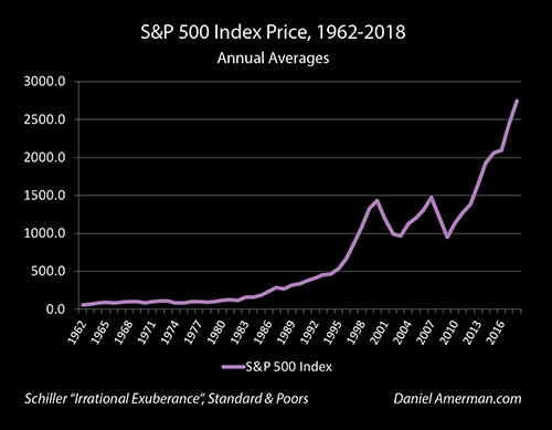
If we just look at stocks over the long term, then we see a sort of zig zag line going up sharply over time.
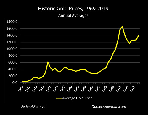
If we look at gold, we see something similar, another asset that rises sharply over time, with the specifics of the zig zags being somewhat different. Just looking at simple price changes in this way - there is no obvious contracyclical relationship.
A problem with the two graphs above is that as with any long term graph of price changes, most of the price increases are effectively an illusion, and what we are really seeing is 50 years of inflation destroying 86% of the purchasing power of the dollar. The issue is that the purchasing power of a dollar in 2019 was only 14 cents when compared to what it had been in 1969. So gold or stocks had to increase in value by almost 7X over those 50 years to just stay even with inflation.
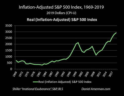
This means our first step in seeing the counter-cycles between stocks and gold is to put everything in inflation-adjusted terms.
Step 1) Adjust for inflation.
When we pull inflation out, and look at price changes in the S&P 500 in inflation-adjusted terms, then the picture changes. We can see that stocks went through a very long, challenging period in the 1970s, then they had a very strong bull market, then a challenging period, then a strong bull market.
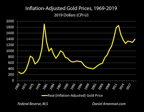
When we look at gold in inflation-adjusted terms, then we can see an initial strong bull market, then a very long challenging period when gold lost money in inflation-adjusted terms, then a strong bull market, and then a retreat from those highs. So, now we are seeing what appears to be opposing price movements in a opposite sequences, but it is very rough. The magnitudes of the movements look quite different, and it is hard to say for sure just how meaningful the relationship is between stocks and gold.
One problem is that the scales are different, which makes it hard to make precise comparisons. So, in order to get a better comparison, our second step is to look at both assets in terms of percentage changes in inflation-adjusted prices. This way, if gold or stocks each move 5% in purchasing power, whether it is in the early years or the later years, it will look just the same.
Step 2) Compare in percentage terms.
Another issue is something which I worked out during the years of research for this analysis, is that the day to day relationship between gold and stock prices is not usually (outside of crisis) very good at all, and neither is the month to month relationship. Annual comparisons are better than daily or monthly, but they can still be a bit on the choppy side. While the majority of inflation-adjusted annual price movements are in opposite directions, they can move the same direction often enough where the relationship is not as reliable as I would like it to be.
However, once we move out to a longer time period - two year comparisons between gold and stocks - then a lot of that "noise" drops out, and the actual relationship becomes much clearer and more meaningful.
Step 3) Make the comparison longer term - 2 year rolling results.
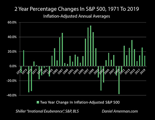
Combining steps 1, 2 & 3, the above graph shows 2 year price changes in the S&P 500 in percentage terms on an inflation-adjusted basis. Please note that these price changes are what are known as "rolling": percentage changes in 2002 reflect the difference between annual average prices in 2000 and 2002, percentage changes in 2003 reflect the difference between 2001 and 2003, and so forth. (This particular series of graphs is 1971 to 2019, with the first result being the two year holding period from 1969 to 1971, and the last being 2017 to 2019, on an annual averages basis.)
Once we look at stocks in this manner, then a lot of the "noise" drops out, and we can see that were some bad troubles in the 1970s to early 80s, and some reasonably equivalent big problems (in inflation-adjusted percentage terms) following the tech bubble collapse and the financial crisis of 2008. However, other than that, just about any two holding period for stocks - even on an inflation-adjusted basis - was positive, and this could hold true for many years at a time.
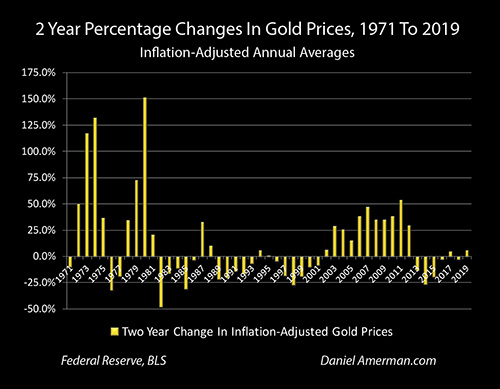
When we use the same three steps to look at historical gold performance, comparing like to like, then we see something fascinating. Scrolling back and forth, using two year inflation-adjusted percentage price changes, there seems to be a very strong inverse pattern: the same clusters where stocks do poorly are where gold is doing great, and the time periods where gold underperforms seem to correspond to the same periods where stock prices are soaring.
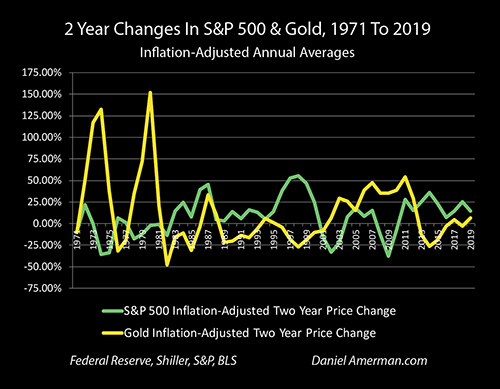
This contracyclical relationship can be seen even more clearly when we put stocks and gold on the same graph, using rolling two year inflation-adjusted percentage price changes.
While it is not a perfect relationship for each period, for the most part over the years either gold is moving up while stocks are moving down, or stocks are moving up while gold is moving down. When we look at the scale and the degree of differences between the asset categories - the difference in outcomes for the investor is enormous.
Seeing The Consistency Of The Secular Counter-Cycles
Once we have seen the relationship and the scale of the differences, our next step is to identify how great the historical advantages were to owning one asset class over the other in rolling two year periods (or the disadvantages).
Step 4) Identify relative advantages with 2 year rolling results.
To accomplish this, a rolling two year end value comparison was done between gold and stocks. The percentage changes in inflation-adjusted prices were compared to each other, for either gold to stocks, or stocks to gold. As an example, if after two years, inflation-adjusted gold prices had increased to 120% of where they started, and stock prices were down to 80%. then the advantage would have been to gold ownership as the gold investor would have had 150% of the assets (120% / 80% = 150%) of what they would have had if they had owned stocks instead (price only).
However, if gold had fallen to 80% in inflation adjusted terms, and stocks had risen to 120% over the two year holding period, then there would have been a disadvantage to owning gold, and the ending assets would be equal to 67% of what they would have been if stocks were owned instead. (80% / 120% = 67%).
When this methodology is used, then we get the graph below, which displays the rolling two year end value advantages and disadvantages on a monthly basis. For instance, percentage changes in inflation-adjusted gold prices between January of 2004 and January of 2006 would be compared to percentage changes in the inflation-adjusted S&P 500 index for that same time period. For the next month, we would roll forward to comparing percentage changes in inflation-adjusted gold prices between February of 2004 and February of 2006, to the changes in stock prices over that time period.
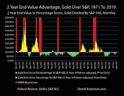
The yellow areas on the graph show 2 year holding periods where there was an advantage on a price basis to holding gold over stocks. The green areas show 2 year holding periods where the advantage was to stocks, and the disadvantage was to gold.
While the end value advantage can climb much higher (up to 500% in 1974), a more recent example of a particularly strong 2 year holding period for gold relative to stocks occurred in the March of 2007 to March of 2009 period. The S&P 500 lost 48% of its value in inflation-adjusted terms over that time, meaning a stock investors only had 52% of their purchasing power remaining after two years. The contracyclical asset of gold gained 36% over those same two years, meaning gold investors ended up with 136% of the purchasing power they started with.
For an individual gold investor then, their being in the contracyclical asset of gold instead of stocks during a time of crisis meant that they would have ended up with about 2.6X the assets of what they would have had if they had been in stocks between March of 2007 and March of 2009. This is displayed by the yellow area of holding periods with an advantage to gold spiking up to 262% (136.4% / 52% = 262%).
A counter example of this very powerful contracyclical relationship can be seen in the 2 years from November of 2011 to November of 2013 (monthly average prices). Gold lost 29% of its inflation-adjusted purchasing power over those two years, while the inflation-adjusted S&P 500 rose by 41% during that time. A gold investor would have ended up with only half the assets of what they would have had if they had been in stocks that had tracked the S&P 500 over those years (71% / 141% = 50%). This can be seen by the green area of holding periods with a disadvantage to gold touching the 50% line in the graph above.
When we look at the graph of inflation-adjusted 2 year end value percentage advantages on a rolling monthly basis, the very powerful contracyclical relationship between stocks and gold becomes boldly obvious on a visual basis.
There is something else that is quite obvious when we look at the relationship between gold and stocks in this way - there is a long term consistency to the relative advantages of gold over stocks, or of stocks over gold, that in most cases extends far beyond two years. This brings us to our fifth level of analysis, which is one of the most important when it comes to practical applications of this powerful contracyclical relationship for investors.
Step 5) Identify the secular cycles of consistent advantages.

As can be seen in the graph repeated above (for ease of scrolling), the yellow areas of an advantage to gold dominate for long periods of time - and the green areas of an advantage to stocks also dominate for long periods of time. If markets were a "random walk", or the relationship between stocks and gold was continuously changing - then what we see above should be more or less impossible. So, let's take a closer look.
The green area of a rolling 2 year disadvantage to gold in inflation-adjusted percentage terms begins with the two year holding period of October of 1979 to October of 1981. With a couple of small exceptions, it persists until the two year holding period of March of 1999 to March of 2001.
On a monthly basis, there are 234 rolling 2 year comparisons over those almost 20 years (inclusive), and only 21 of them show an advantage to gold, with those advantages usually being quite minor. The other 213 two year holding periods, which is 90% of the total, all had an advantage to stocks, with much of those being to a quite substantial degree.
A good example of a long term counter-cycle is what begins the month after the previous cycle ends, which is the April of 1999 to April of 2001 two year holding period, and persists until the February of 2011 to February of 2013 two year holding period. On a monthly basis, there are 143 rolling 2 year comparisons over the almost 12 years, and only 12 of those show a minor advantage to stocks. The other 131 two year holding periods, 92% of the total, all consistently show a advantage to gold over stocks, with the advantage often being quite substantial.
The advantage consistently shifts again in the cycle that begins with the March of 2011 to March of 2013 holding period, and ends with the December of 2017 to December of 2019 holding period. Over this cycle, 72 of the 73 rolling 2 year holding periods favored stocks (99% of the total), and only one, the 2 years between October of 2017 and October of 2019 favored gold. This is of course likely to be changing fast given the events of early 2020, and the ratio of the inflation-adjusted two year percentage changes between gold and the S&P 500 on a rolling monthly basis could be a very good indicator to keep an eye on.
Financial Advantages Of Long Term Cycles Of Consistent Advantages
The persistence of long periods of rolling financial advantages to one asset, followed by a long cycle of rolling financial advantages to the counter asset, is of critical financial importance and creates numerous opportunities for investors who are aware of these relationships.
Now, on the one hand, some degree of consistency is to be expected. If we compare two consecutive two year holding periods on a monthly basis, say the July of 2017 to July of 2019 holding period, with the following August of 2017 to August of 2019 holding period, they have 23 of 24 months in common, and unless something really big happened in July of 2017 or August of 2019, they should have a lot in common.
However, if we look at the example of 1980 to 2000, or 2000 to 2012, or 2012 to 2019 (looking at the mid-years on the transitional two year holding periods), then we have about ten non-overlapping two year cycles strung together that favor stocks, followed by about six non-overlapping two year cycles that favor gold, followed by three cycles that favor stocks.
Now, even allowing for the 10% "model error" of the 21 of the 234 two year cycles favoring the counter asset in the first cycle, and the 8% in the second cycle, and the 1% in the third, the odds against this stringing together of rolling financial advantages being just a series of random outcomes are astronomical. What we are seeing is long term and highly consistent, meaning these are truly secular cycles, with secular usually being defined as a cycle of ten years or more.

The other just critical information for investors that can be obtained from the graph above is that the source of financial advantage is not a series of individual turning points in time, where once they have already happened it is too late to do anything about them. Instead, there is a consistent difference in wealth creation that persists for long periods of time - and can be captured at any (or all) of a number of different holding periods over the course of those long periods.
When we look at the first cycle that favors gold, there isn't just the one biggest spike of a 500% advantage between 1972 and 1974 (London exchange prices), where you catch it just right or miss it all. Instead there is a long series of major financial advantages to gold over stocks, persisting over a decade, and cumulatively building for someone who was in gold for the entire cycle.
Similarly, when we look at the two decades of rolling two year advantages to stocks over gold, there wasn't just one event or one turn, where you were in it or you missed out. Instead, there were long periods of consistent and major relative wealth creation for being in stocks instead of gold. There were very long windows for consistent and building relative financial advantage in the early to mid 1980s, the late 80s through the mid 90s, and the mid 90s through the turn of the century, as well as for the two decades taken as a whole.
Yes, gold did peak in terms of relative financial advantage to stocks at the time of the financial crisis of 2008 - but that wasn't the only event, or even the source of most of the financial advantage. Every bit of the yellow area over the 12 years was a financial advantage to gold over stocks, it existed for almost the entire time period, and it cumulatively created wealth on an ongoing basis over the course of the entire cycle.
And if someone had missed the initial turn from gold to stocks, that for the mid-year of the two year holding periods occurred in 2012 - so what? Sure, some yield would have been left on the table, but the great majority of the green area of wealth creation advantages for stocks over gold occurred after that time, continuing to cumulatively build.
Our sixth analysis step is to aggregate the holding periods on a secular basis, to try to capture the complete financial advantages to being in the right asset class over the long duration of the cycles.
Step 6) Aggregate the secular cycles.

It is the long series of rolling two year financial advantages to gold that produced the 12.3 to 1 advantage on an inflation-adjusted basis, to being in gold over stocks between 1969 and 1980. Those numbers are entirely real, they build over many shorter segments that accumulate over the interim years, and the ending advantage of being in gold over stocks is stunning - as is the ending disadvantage (not including dividends) of having only 8% of the assets if one had been in stocks instead of gold.
Yes, someone would have been 26.4 times better off if they had been in stocks instead of gold between 1980 and 2000, and this wealth differential was built on a very long and (reasonably) consistent basis over the two decades. Conversely, if they had ridden gold out for the two decades, they would have had only 4% of the ending assets compared to if they had been in stocks.

Combine the two holding periods over the 31 years from 1969 to 2000, and someone who went from owning gold to owning stocks in 1980, averaging in and out over the course of the year at the average annual prices for 1980, would indeed have 325 times the net worth of someone who had done the opposite. That is the result of just two decisions - spend a year averaging into gold the first year, spend a year averaging over into stocks in 1980, and the end result is 325X the assets (price only).
Now, this is not a perfect hindsight game, like wishing we had somehow known to make the brilliant call of buying IBM or Berkshire Hathaway early, or Apple or Google early, in terms of individual (then) obscure stocks that would turn out to generate a performance that wildly exceeded tens of thousands of other stocks. Instead, this is annual average performances of the generic results for two vast asset classes in each year.
Someone who made three correct decisions over 43 years would, for real, have over 2,000 times the ending assets of someone who made the three opposite decisions. And someone who made four correct decisions over 50 years, using generic prices for two vast asset categories, would truly end up with 5,000 the net worth when compared to someone who made the four opposite decisions over the 50 years.
That said, as a result of my years of research and the body of work that went into developing this analysis, I should say that I don't actually see achieving see the 5,000 to 1 relative advantage as being the goal, or at least not necessarily for everyone.
Oh, it's not a bad goal - but one doesn't actually have to hit it, or come very close at all, to have a potentially life-changing difference in financial outcomes. Some people would say that 4,000 to 1 or 2,000 to 1, or maybe even 100 to 1, 10 to 1, even just 2 to 1 when it comes to their the relative amount of their personal assets in retirement as being quite attractive outcomes in their own rights.
Now, the farther away we go from 5,000 to 1, the more that can go wrong, the less good we have to be, while still achieving what would be a highly desirable outcome for most people.
Instead of just making calls about what asset to be in, I also look at it as being "excess room", in terms of how much can be extracted in terms of higher yields - or lower portfolio risks - that don't require perfect timing or some form of foreknowledge. If we have so much to begin with, then how much can we effectively "throw away", while still generating highly advantageous results in a risk-contained manner over shorter (but still long term) time periods?
The video above is about a 20 minute introduction to a video resource that I have created on these subjects (DVD brochure linked here).
Because the swings between the performance of the two contracyclical assets have historically been so large, and because they have persisted over very long time periods, there are many ways of using both assets together - over the long term (month to month or year to year can be a quite different matter).
We can use various strategies for automatically rebalancing assets, with no timing or market calls at all. We can pursue lagged strategies, that make no attempt to call the markets in advance, but instead rely on hindsight and analyzing what has already happened, perhaps even a year or two afterwards.
We can use ratio strategies to extract excess yields while still protecting against downside risks, with a built in insurance investment in the counter asset in a sufficient amount to hopefully protect us (over the long term) if we're wrong. We can combine ratio strategies with an insurance component along with a rebalancing strategy to avoid the need for timing calls, and have two levels of protection, while still positioning to harvest part of the excess yields (the combined results of these two levels of risk protection versus buy and hold on the preferring underlying asset are fascinating over long holding periods).
To be clear - every time a risk is removed or mitigated, the returns go down, sometimes way, way down, exactly as one would expect on a reality basis. If there is enough potential to begin with, then a lot can indeed be given away, while still potentially leaving comparatively attractive results on a risk controlled basis.
Or, someone who is so inclined can also just try to learn everything they possibly can about the contracyclical relationships, take a portion of their portfolio, and make an attempt for that 10 to 1, or 100 to 1, or even 300 to 1 relative financial advantage over a 10, 20 or 30 year period.
One thing that we do know about the next fifty years - is that they won't be just like the last fifty years. So, there are never guarantees, and the future can always travel down some quite unexpected paths.
That said, arguably most of financial planning and analysis comes down to looking at numbers from the past over time in terms of how asset performance in a category (such as stocks or gold) has worked, and then on some level, making plans that are ultimately based upon capitalizing on previous relationships being expected to repeat themselves (at least within a certain range).
What we examined in this analysis was the compelling and extremely powerful secular and contracyclical relationship between gold and stock prices in inflation-adjusted terms, and it was reasonably robust over the fifty years studied. So, while understanding that does not equate to certainty when it comes to the future, there is still a great deal of value to be learned by studying these relationships, and hopefully this analysis was helpful to you in that regard.
Learn more about the free book.
********************************************
Watch The 2020s Edition Online
Learn more about the contracyclical strategies for gold and stocks, brochure link here.


