


Calculating Your Personal Cost If Stock, Bond & Home Prices Return To Average
by Daniel R. Amerman, CFA
TweetWe currently have well above average prices for stocks, bonds and homes. This raises a simple question - what would happen to the average retirement account and to home equity for the average homeowner, if valuations were to return to what long term averages show us are normal valuations?
Using decades of valuation information on stocks, bonds and homes, this analysis develops numbers in each category that show how much of current national stock, bond and home prices represents average values, and how much is a premium above normal valuations.
Using those historical values and the illustration of an example homeowner and retirement account investor, it is demonstrated that the current premium is around 59% above long term average valuations. How the loss of such a premium could have life changing implications for tens of millions of homeowners and retirement account investors is reviewed.
This analysis is part of a series of related analyses, which support a book that is in the process of being written. Some key chapters from the book and an overview of the series are linked here.
Abnormally High Stock, Bond & Home Prices
Analyzing what happens if prices return to average is also known as "regression to the mean", and it is one of the fundamental tools of financial analysis. When we look at valuations over the long term for stocks, bonds, housing or almost any investment class, what they all share is cycles of being higher than average at times, cycles of being lower than average at times, and then returning to that long term average valuation again and again, as the cycles go up and down around the average.
Whether we want to call it a return to average valuations, or regression to the mean, the key concept is that if we can identify prices that are well above historic averages (after adjusting for inflation and changes in corporate earnings and so forth), then over time, they are likely to fall to average valuations. And if we can identify prices that are abnormally cheap relative to long term averages, then chances should be good that over time a return to average price levels may provide a particularly good return.
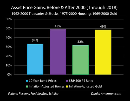
As can be seen in the graph above from Chapter One (link here), 10 year U.S. Treasury obligation prices are about 34 percent higher for the period between 2001 and 2018, than they were between the years 1962 and 2000. (As developed in that and other chapters, the very low interest rates and then monetary creation by the Federal Reserve in the containment of the damage from the popping of the tech stock bubble in 2001, and then the Financial Crisis of 2008, have fundamentally changed investment prices in all categories.)
For stocks, we are not looking at prices (which rise with corporate earnings and the economy), but how much investors pay when they buy a stock for each dollar of corporate earnings. This key measure is what is known as the price/earnings ratio or PE ratio. If investors are paying a lot for corporate earnings, meaning a high PE ratio, then we have very rich valuations for stocks. Conversely, if investors are paying very little for each dollar of corporate earnings, meaning that PE ratios are low, then shares are relatively cheap. Compared to long term averages, PE ratios have been very high, and on average are up by about 50 percent since 2001.
We currently have record home prices across the country, and because home prices rise with inflation, that is reasonably common. However, even after we adjust for inflation, and take home sizes and locations into account - home prices are on average still unusually high across the country, and are about 32% higher than long term averages.
(We won't be going into the fourth column in this particular analysis, but we also currently have had gold valuations since 2001 that are about 50 percent higher than the long-term average, even on an inflation-adjusted basis.)
An Example Retirement Investor & Homeowner
Now, let's take a round number look at a hypothetical investor, with a million dollar net worth. The advantage to a $1 million dollar net worth is that it's really easy to do quick percentage comparisons, whether that is for someone with a $300,000 net worth, or a $600,000 net worth, or a $3 million net worth.

We will assume that this investor has $800,000 dollars in investments, that they have built up primarily in retirement accounts. We will also assume that they have a $500,000 home with a $300,000 dollar mortgage on it, so a 60% loan to value.
A common allocation for investor who are either right on the cusp of retirement or perhaps have just retired, used to be for 60% of their portfolio to be in stocks for reasons of seeking the highest returns, and 40% in bonds, for reasons of safety and cash flow. However, because bond yields have been so very low since 2001, many investors have been upping the allocation to the (riskier) stock component. (This is an example of the Investor Life Cycle approach to financial planning, where generally speaking, the younger someone is, the more of their portfolio is allocated to stocks, and the older they are, the more of their portfolio is allocated to bonds.)
We will therefore use a 75/25 allocation between stocks and bonds in the illustration portfolio, which would mean that $600,000 of the retirement investments are in stocks, and $200,000 is invested in bonds. (For most retirement account investors, these are more likely to be in mutual funds or ETFs that are invested in stocks or bonds, but the same numbers apply.)
When we put it all together, the $600,000 in stocks, $200,000 in bonds, and $200,000 in home equity add up to the round number $1 million starting net worth. The next step is to take individual looks at each one of these categories on a historical basis, and see what history shows us average valuations have been.
Changes In Average Stock Valuations
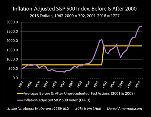
The above is a graph of the S&P 500 stock index on an inflation-adjusted basis, which we will use to represent stocks in general. It is visually obvious that there has been an extraordinary increase in valuations since the mid 1990s, however, a big part of this is the growth in the American economy and the growth in corporate earnings.
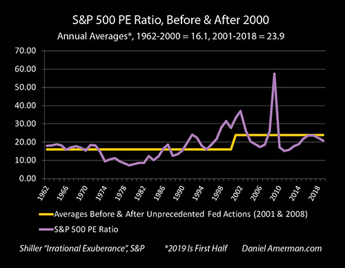
To determine whether stock valuations are relatively high or relatively low compared to long term averages, a better measure is to compare PE ratios, the price investors pay for each dollar of corporate earnings that "belongs" to their percentage ownership of the corporation.
Before the Federal Reserve began its extraordinary interest rate and monetary creation interventions, the average PE ratio with historically average interest rates was 16.1 in the years from 1962 to 2000. From 2001 to 2018, the average PE ratio has been 23.9, which is about 50% above long term averages.
The other way of looking at this is that if we go from our more recent average PE ratio valuation of 23.9, and we return to that long-term historical average valuation of 16.1, that would require taking a 33% hit to our stock price.
This may sound like a very bad scenario, or some kind of extreme gloom and doom talk - but that is not at all the case. All that a 33% decline in stock prices would represent would be a regression to the mean, a return to long term averages. What we need to keep in mind when looking back at history is that prices are above average about half the time, and below average about half the time (keeping in mind that the median is not the same as the mean).
On a historical basis, PE ratios were below 16.1 about half of the time. So, if we wanted to explore the actual downside, we would need to look at the places where the purple PE line in the graph above goes well below the gold average line, such as in the later 1970s and early 1980s. Between 1978 and 1982 PE ratios were bouncing up and down in around the 8 range or so. This means that an actual downside scenario (a market bottom) involving higher interest rates and major economic difficulties could be in the neighborhood of a 67% loss from a 23.9 PE ratio, instead of a 33% loss. With eventual recovery and stabilization, there could be a doubling in valuations, bringing stock valuations and PE ratios back up to long term averages and a "mere" 33% discount relative to the current highly elevated stock valuations.
Exploring gloomy downside scenarios is however not the point of this analysis. All we are doing is looking at the impact on average investors and homeowners if valuations for stocks, bonds and homes merely return to the long term average valuations that prevailed for decades before the Fed's extraordinary interventions, and not at the below average valuations that are necessarily about half of that history.
Changes In Average Bond Prices
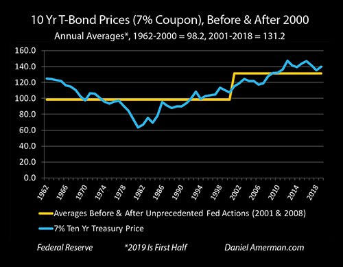
To compare more recent bond prices to long term averages, we're going to look at a 10 year U.S. Treasury obligation with a 7% interest coupon. Because that 7% is little bit below what average ten year yields were between 1962 and 2000, this bond would have had an average price of 98.2 cents on the dollar over those decades, meaning investors would have paid $982 for a $1,000 bond.
Of course, in today's environment, getting a government guaranteed 7% yield seems really high, and on average between 2000 and 2018, investors would have paid 131.2, or $1,312 for a $1,000 bond.
When we compare a price of $1,312 to a price of $982 - for the same bond - that means that investors in a time when the Fed has been creating unprecedented interest rate distortions, have been paying a premium of 34% when buying ten year bonds.
Going the other direction, to go from a quite elevated price of $1,312 down to a long term average price of $982 would require taking a 25% loss.
Bonds are of course highly variable, with many variations based on term, credit quality and whether they are government, corporate or tax-exempt obligations. Using the 10 year Treasury is meant to establish a reasonable approximation, some bonds would have greater losses and some less.
And again, the intent of this particular analysis is to put some numbers on what a return to long term averages could mean for average people, and not to explore downside scenarios. Looking back at history and as can be seen above, the downside scenario would be something in the range of a 50%+ loss. As one example, this could happen if the Fed lost control even as the national debt was still climbing fast, which could lead to simultaneous drastic increases in both interest rates and inflation. That could happen, but it is a different thing from exploring a simple regression to the mean.
Changes In Average Home Prices
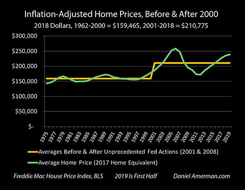
The above graph takes a look at single family housing prices on a national basis. It combines a dollar price for a nationally average home for 2017, with percentage changes in the national Freddie Mac House Price Index, and also adjusts for inflation.
In 2018 dollars, a home with a size equal to the average for 2017 homes, would have had a long term average price of $159,465 over the years from 1975 to 2000. That same nationally average home would have had an average price of $210,775 in the years from 2001 through 2018.
When we compare the $210,775 average price for more recent years, to the $159,465 price for an equivalent home over the longer term, then homes have been priced an average of 32% higher than they used to be, in inflation-adjusted dollars. As covered in much more detail in other chapters, the extraordinary Federal Reserve interest rate and monetary creation interventions since 2001 have led to far below average mortgage rates, which have supported much higher home prices than used to be the case.
When we go the other direction, then a return to historically normal mortgage rates and historically average home prices could on a national basis lead to a 24% average decline in home values on an inflation-adjusted basis.
Now, an interesting thing about housing is that it used to be much less correlated with financial markets than the other asset categories of stocks and bonds, with more stable valuations that were less subject to cyclical changes. So, when we look at a downside scenario and assume that the nation were to go all the way down to the lowest annual valuations from 1975 to 2000 in inflation-adjusted terms, then housing would lose about 32% of its value when compared to more recent averages. This is far from desirable, but not nearly as bad as the 67% loss with stocks or the 50% loss with bonds.
Combining The Losses In Each Category
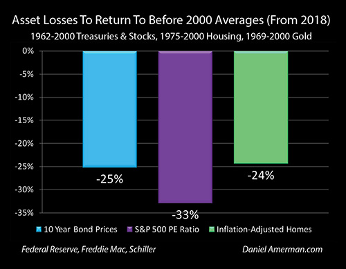
When we put all of this information together and compare the averages from 2001 through 2018 to the long-term averages for each asset category, then we get the graph above.
A regression to the mean or return to averages would involve a 25% loss on bonds, a 33% loss on stocks, and a 24% loss on inflation-adjusted home values. When we take these percentages, and apply them to our example retirement investor and homeowner with the round number million dollar net worth, then we get the graph below.

We begin with the assumed $600,000 starting stock portfolio, calculate the cost of the 33% loss (with a few more significant digits) that would be associated with a return to long term average stock valuations, and find that there would be about a $200,000 loss.
If we take a look at a $200,000 starting bond portfolio and we apply the 25 percent loss that is required to return to historic average bond valuations, then the loss would be about $50,000.
If all of the starting $800,000 were in retirement accounts, then combining the stock and bond losses associated with a mere return to long term averages would reduce the value of the retirement savings by about $250,000, or a quarter of a million dollars.
If we take a half million dollar home, and apply the 24% loss that would be associated with a return to long term inflation adjusted home valuations, then that would be about a $120,000 dollar loss.
In total, the combined losses required to return the stocks, bonds and home to historically average valuations would be equal to about $370,000, which equates to a 37% reduction in net worth for some who started out with a million dollar net worth.
As extreme as this would likely sound to many people, keep in mind that this is not a downside scenario - but simply a regression to the mean. About half of long term financial history consists of lower asset prices than the averages that are shown above, and in many cases these prices are quite a bit lower.
Net Worth With Historically Average Asset Values
In Step One we started with a $1 million net worth at the average elevated valuations of recent years. In Step Two we adjusted for the changes necessary to move stock, bond and home prices down the long term averages of prior decades.
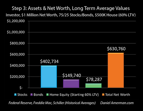
When we combine the first and second steps, then we get Step Three as shown above: what our example retirement account investor and homeowner would actually have with historically normal asset values.
Instead of owning $600,000 of stocks, those exact same shares would be worth about $400,000 with a historically average PE ratio. Instead of owning $200,000 in bonds, those exact same bonds would be worth about $150,000 with historically average interest rates.
Instead of having a house worth $500,000, a more historically normal home price for the same home would be about $380,000. And if that person had bought the $500,000 home with a $300,000 mortgage, and the price were to later return to a long term average value of $380,000, then instead of $200,000 in home equity, they would have about $80,000 in home equity on the exact same house.
Same stocks, same bonds and same house. All it takes is returning to long term asset valuations for all three asset categories, and the net worth of the illustrated retirement investor and homeowner would be about $630,000, instead of the prior $1 million.
Another and perhaps better way of looking at this, is that about $370,000 of the example $1 million net worth is not "natural", but rather represents abnormally high stock, bond and home valuations that have been created by the Federal Reserve's heavy-handed interest rate and monetary creation interventions. What long term financial history shows us is that the "natural" net worth for someone owning those same stocks, bonds and home is about $630,000.
So that investor (and the nation) is currently enjoying about a 59% premium ($1,000,000 / $630,000 = 159%) above their natural net worth with long term valuations. And if they look at that 59% premium, and they would like to keep it, and they don't want to unexpectedly lose it in the coming years - then perhaps the single most important part of their financial planning process involves understanding why values are so high, what could bring those values back down to average, what the chances of that happening are looking like at any given time, and what they could potentially do about. Without that knowledge - they could be subject to the defining and life changing financial blindside of their lives at any given time.
Keep in mind that if such a regression to the mean were to occur, such a return to average valuations, then the loss of this 59% premium would apply to all of the tens of millions of the people in the United States who do have retirement accounts invested in stocks and bonds, and who do own their homes. Now, the specifics would of course vary greatly - but in broad strokes, these same valuation principles would apply, with some people facing more damage and others facing less.
Those who would be devastated include many of our friends, family, neighbors and colleagues, and it would be truly life changing. It would fundamentally change spending and the economy for the nation, it would fundamentally change standards of living in retirement for the nation - and it would likely come as a complete surprise for most of the nation.
A Reasonable & Moderate Reality Check
My guess is that for millions of the people who would be the most affected, what is presented herein would be interpreted as some sort of far out or even apocalyptic gloom and doom scenario.
That was not at all my intention in preparing this analysis, nor is that what is presented herein.
I think most people who are reasonably well read in finance are very well aware that stock valuations are unusually high, interest rates are unusually low (which means bond prices are unusually high), and housing prices across the nation are unusually high. There is nothing controversial about those beliefs, variations on them can be found in numerous articles in the financial media on just about any given day.
There are some natural and very important questions that arise from that situation. How high are these asset values compared to the norms, why are they so high, what is the exposure of the average person to a return to normal values, what sorts of things could bring about such an return, and how likely are they?
In many ways, what this book in process is all about is attempting to answer those questions, in ways that can be understood by people who are not necessarily financial or economic professionals.
What I did in this particular analysis was to look at three of the most important asset categories for individuals and put some real numbers on the situation, using the actual historical numbers from the most reputable heart of the financial mainstream. If you look at the bottom left corner of the graphs of the averages, the sources include databases from the Federal Reserve, Freddie Mac, Standard & Poor's (via Robert Shiller), and the Bureau Of Labor Statistics. A researcher or academic might quibble with the years chosen or some of the particulars of the methodology used, but these are the actual histories for those asset classes, assembled from what are considered to be the best available sources.
Keep in mind as well that about half of those databases consist of valuations that are lower than the averages presented - this truly is not an alarmist scenario, but a middle of the road scenario.
When we look at the differences in average values, the reduction in net worth from the illustrated $1 million down to $630,000 and the loss of the 59% premium, then what we are looking at is what could be the single most important event in a lifetime of investing - and home ownership - for many millions of people, with this being particularly true of the Boomers. Unlike the generations before them, the Boomers on average will have many more years to live in retirement on whatever savings they have, and unlike the generations behind them, if there is a steep fall in asset prices, then the Boomers are unlikely to have the time to rebuild their savings before their target retirement age.
The point of this analysis was to present a reasonable and moderate reality check - not any sort of doomsday scenario. We do have the highest asset prices in history, even after adjusting for inflation and the growth in corporate earnings, when we look at the combination of stock values, bond values and home values. This analysis put reasonable numbers on just high those valuations are relative to historic averages.
A fundamental principle of achieving genuine financial security is to at a minimum be able to handle a regression to the mean, a return to average values. This analysis put reasonable numbers on the decline in stock, bond and home values that would need to be covered in such a case.
Let's step back and consider the situation. If a person would be devastated by a mere return to average, and they therefore reject even the possibility of a simple return to average as being emotionally unacceptable - are they really achieving financial security?
Is the financial planning that will play a key role in determining their standard of living for potentially the rest of their lives - really built on a sound foundation in that case, or on something else altogether?
The time to fully understand these issues is before they happen - when there is still room for better decisions, and time to make changes. I hope that the financial analysis and historical information provided herein has been helpful to you in that regard.
Identifying Some Parameter For Answering The Key Questions
Why are asset values so high?
What could bring them down to earth?
What could send them still higher?
What is in play right now, that can give us better understandings of what is happening?
As explored in Chapter One, the underlying foundation for historically elevated asset prices is extraordinary and heavy-handed Federal Reserve interventions that have forced historically low interest rates on the nation.
Anyone who's been keeping cash in money market funds or interest-bearing checking accounts, or who is reliant upon any form of interest income is of course very well aware of this problem.
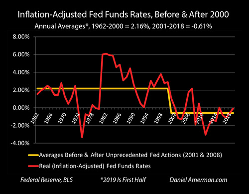
As shown above and also explored in Chapter One, there is something that is even more important - and irrational - which is that the Federal Reserve is forcing interest rates down to levels that are on average below the rate of inflation. This is not a place that investors will rationally go on their own, at least not for sustained periods of time.
Indeed, if we look at the period from 1962 to 2000, before the extraordinary Federal Reserve interventions, investors quite rationally demanded that even overnight investments bear interest rates that were on average more than two percent above the rate of inflation.
Since 2001 the Federal Reserve has forced the nation down to what is on average a -0.61% inflation-adjusted yield in high quality overnight loans. This is an extraordinary intervention, that is changing all asset values.
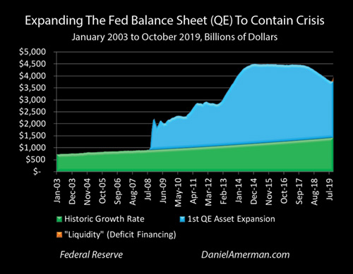
Another change has been the Fed's extraordinary and unprecedented use of monetary creation, flooding the markets with cash to move rates and prices where the Federal Reserve wants them to go. What is shown in the blue above is the unprecedented policies the Federal Reserve has been engaging in since the financial crisis of 2008, creating money through a process that is usually referred to as quantitative easing.
The Federal Reserve has been creating trillions of dollars out of what is effectively the nothingness, and using that money to buy things like U.S. Treasury obligations and mortgage-backed securities, directly forcing prices well above historic averages - and indirectly setting the foundation for the highly elevated stock and home prices that we see today.

A third issue is the critical factor of the U.S. national debt reaching dangerous levels, which reinforces the need for very low interest rates, that in turn maintain very high asset prices for stocks, bonds and homes.
A change that is really coming to the fore as we enter the 2020s is that the U.S. government's voracious need for cash to fund the rapid growth of the $23 trillion national debt is beginning to threaten the Federal Reserve's control over interest rates not just in theory, but in real time.
As covered in Chapter 18 (link here), this then creates the situation that the true immediate danger from a soaring national debt is not so much a distant default or round of hyperinflation - but higher interest rates, that could rapidly bring stock, bond and home prices back down towards the historic averages shown herein, with the corresponding life changing implications for many millions of people.
It is highly ironic what while many investors are not taking historically elevated asset prices into account in their planning, even while they are blithely unconcerned about any personal impact from the national debt - it may very well that at some point it is the national debt and deficits that triggers the interest rate increases that could lead to situations such as the loss of the 59% premium, for them and the nation.
What all of these factors have in common is that they aren't fair - they are complicated. They are outside of what people are told they need to know in order to have the financial education needed to make good personal decisions. Inflation-adjusted interest rates, Federal Reserve monetary policies, monetary creation, and the funding of the national debt are just not what most people are taught to think about when they are making decisions about stocks, bonds or their homes. Relatively few people have the appropriate education in these areas.
In this book I have been trying to close that gap, I believe it is essential to do so, and I hope that this has been working for you.
Learn more about the free book.
***************************************************
Read Chapter One Of "The Homeowner Wealth Formula"
Read Chapter One Of "The Eight Levels Of Homeowner Wealth Multiplication"