


Gold, Stocks & The Pandemic: A Powerful Contracyclical Play In Action
By Daniel R. Amerman, CFA
TweetWhile the use of gold to protect against inflation is well known, it has other investment attributes that are potentially even more valuable, and this is particularly true in times of crisis.
In this analysis, we will examine the relative performance of gold and stocks (as represented by the S&P 500) between early February and late May, as the coronavirus pandemic and the resulting economic shutdowns transformed global economies and markets.
The short term relationship that we will find is an almost perfect match with what fifty years of financial history shows us is perhaps gold's most valuable investment attribute over the long term, which is its contracyclical relationship with stock prices.
This analysis is part of a series of related analyses, which support a book that is in the process of being written. Some key chapters from the book and an overview of the series are linked here.
Creating The Gap
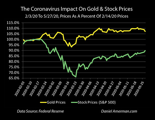
The above graph shows price movements for gold and stocks (as represented by the S&P 500) since February 3rd of 2020. The prices are in percentage terms, with 100% equaling the market closes on February 14th, which were $1,581 an ounce for gold (London exchange) and 3,380 for the S&P 500 index.
Both gold and stock prices were relatively stable at around 100% until February 24th, when escalating fears of the coronavirus pandemic led to a sharp downturn in stock prices. At that exact same time - gold prices began rising.
The S&P plunged to 2,237 by March 23, 2020, a decline of 34%. Gold prices reached $1,748 an ounce by May 20th, an increase of almost 11%.
The relationship is not perfect on a day to day to basis. But nonetheless, a widening gap appeared - and persisted - between gold and stocks. This gap between the green and gold lines is a very short term example of a very powerful long term relationship between gold and stocks, which is not about inflation, and is arguably the single most valuable advantage to owning gold as an investment.
At the end of February, I was also just releasing some new research that was based on detailed study of the relationship between gold and stocks over the fifty years between 1969 and 2019. One of the most important things that I found - was a long term graph that looks a great deal like the recent short term graph of gold and stock prices.
As a starting point, the monthly relationship between gold prices and stock prices is not that strong, and even when we look at it on annual basis with historical prices - the relationship is not compelling.
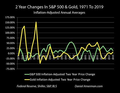
However, when we take six analytical steps, as explored one by one in Chapter Nineteen (link here), then a very strong contracyclical relationship between stocks and gold can be found, as shown in the graph above. Two of the most important steps are to strip out inflation from both gold and stock prices, and to move to a longer term, 2 year comparison period (the first comparison period in the graph above is the 2 years of 1969 to 1971).
When we take those steps, then a series of gaps appear - and they usually move the opposite directions. When the green line of inflation-adjusted stock prices is moving up - the gold line of inflation-adjusted gold prices is usually moving downwards, and a gap opens up. When the gold price line is spiking up - the green line of inflation-adjusted stock prices is moving downwards and a gap opens up. So what we are seeing with recent price movements and the gap opening up as stocks remain down while gold remains up, is a very short term example of strong, fifty year relationship.
Contracyclical Rewards & Penalties
When we look at contracyclical assets such as stocks and gold, then which asset class one is invested in, for any phase of the cycle, is of critical importance.
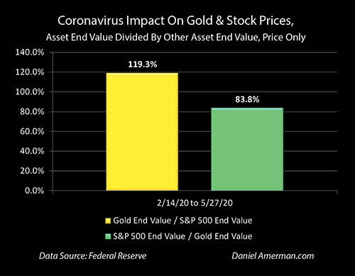
As of May 27th, someone who invested in gold would have had 107.2% of the value of their starting investment on February 14th. Someone who was invested in the S&P 500 would have had 89.8% of their starting investment (price only) - even after the strong stock comeback that was fueled by a fantastic degree of monetary creation by the Federal Reserve.
So, someone who was in the contracyclical asset of gold would have been 119.3% better off than if they were in stocks, the value of their investments would have been almost 20% higher (107.2% / 89.8% = 119%).
Conversely, if someone had chosen stocks over gold, then they would have had only 83.8% of the money they would have if they had made the opposite choice. (89.8% / 107.2% = 84%).
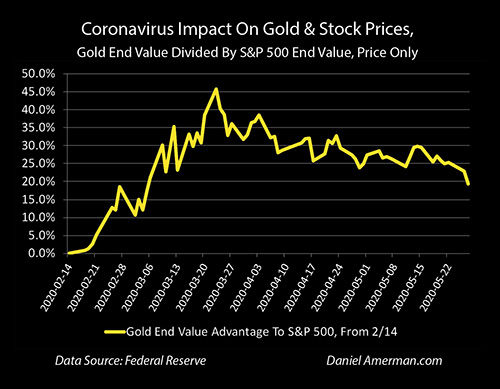
When we track this relative advantage to holding the contracyclical asset of gold over stocks on a daily basis during a down cycle for stocks, then as shown above, the relative advantage to owning gold over stocks peaked at 46% on March 23rd, the same day that the stock low for the period was reached. For that first critical month after the break between the contracyclical assets appeared, someone who held gold instead of stocks would have had 46% more assets on the peak day.
Again, this is a very short term example of a much longer term relationship. During this time of dramatic change, gold and stocks followed their fifty year script very well indeed. In more ordinary times, when there aren't major changes, then daily and weekly changes can look almost random.
So what the extraordinary events of February to May did was to cast an intense spotlight on a very strong long term relationship, and make unusually visible what that relationship is in what could be called more or less real time.
When we do move to a longer term perspective, then what my research shows is that the relationships become not only much more reliable, but also much more financially critical, with relative advantages or disadvantages that vastly exceed a "mere" 46% or 20% difference.
Seeing The Long Term Power
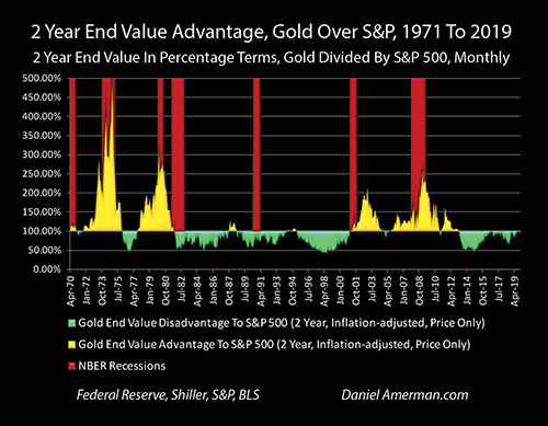
The graph above compares the advantages or disadvantages in being to gold relative to stocks over 50 years, on an inflation-adjusted, rolling two year basis. For instance, January of 2000 to January of 2002 would be one comparison, February of 2000 to February of 2002 would be the next, and so forth.
As previously developed in the shorter term analysis, if gold had gone from100% to 120% over the two years on an inflation-adjusted basis, while stocks had gone from 100% to 80%, there would have been a 50% advantage to being in gold for that period (120/80 = 150%), and that would show in the gold area above of advantages to gold. Conversely, if gold had gone from 100% to 80%, while stocks went from 100% to 120%, then someone would had only 67% of the ending assets relative to the stock investor and that would show as a disadvantage in the green area.
Using this methodology allows one to plainly see that the relationship between gold and stocks is not only contracyclical, but it is secular, with long term and almost entirely consistent advantages to owning one asset over the other.
With the first secular cycle, almost every two year comparison favors gold, meaning the trend was sustained for over a decade. So it isn’t just that gold strongly outperformed stocks (price only) over the 11 years from 1969 to 1980, but there was a very strong consistency to it.
The advantage shifted to stocks strongly outperforming gold with an almost equal degree of consistency from 1980 to 2000. Then from 2000 to 2012 there was a sustained and highly consistent rolling two year advantage of holding gold over stocks. And from 2012 through 2019, there was an almost completely consistent rolling two year advantage to holding stocks over gold.
When we look back over the last fifty years, and look at the full secular cycles, then we see a historical relationship that dwarfs what we have seen even in the dramatic changes of the last few months.
This understanding of long term is essential, when it comes to properly understanding the recent short term.
Someone who is focused on short term decisions might look at the chart repeated above, and say "whoops, missed it, but it is in the past now as the stock market improves based upon promises of massive Federal Reserve monetary creation funding extraordinary levels of asset purchases and stimulus spending." And for the short term, that could very well turn out to be true.
However, if this wild and crazy experiment of shocking the whole world out of a government induced severe recession / potential depression simply through creating vast sums of money - which has never worked before, there is no precedent - were to not work out in practice, then we could have a genuine secular turn in the cycles, as we have seen four times in the last fifty years.
If this does turn out to be the case - missing the initial 20% is nothing.
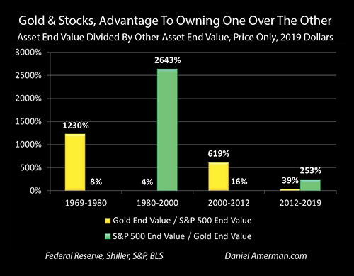
As can be seen in the "Gold & Stocks, Advantages To Owning One Over The Other" graph, the first cycle favoring gold produced a 1230% advantage to owning gold over stocks (on a price only basis). This overwhelming advantage steadily built over the entire 11 years, and the 20% advantage to gold we are seeing in the current market is only 1.6% of what the long term advantage turned out to be. (And yes, there is a counterpoint that someone who had 20% more initially invested, would end up with 20% more 11 years later, but the point is that the overwhelming majority of the relative gains occurred over the long term and not on the front end.)
Another way of looking at it, as can not quite be seen with the invisible green bar on the left, is that someone who had stuck to their belief system of stocks being better than gold over that secular cycle would have ended up with 8% of the assets from price changes, that they otherwise would have.
If we look at the second secular cycle of buying stocks over gold that started in 2000 and lasted until 2012, which initially involved picking up gold at an annual average price of $279 an ounce in 2000, even as the tech stock bubble was reaching its peak, then the 12 year advantage of gold over stocks was 619%. The recent 20% advantage is only 3.2% of the 12 year total advantage.
Conversely, someone who had stuck to their guns on stocks over gold over the 12 years would have had 16% of the ending assets relative to the opposite choice, on a price basis.
Now, it would be easy for someone to dismiss this as mere cherry picking the best comparison period with 20/20 hindsight, but that is not at all the case, and misses perhaps the most interesting - and practically usable - part of my research.
As covered in much more detail in Chapter Nineteen, and as can be seen in the graph repeated above, the great majority of the relative advantage to gold over stocks was not produced in the first two years, but on a steady basis over time.
Most of the graph area above is gold through 1980, meaning a rolling two year advantage to gold over stocks. There were 234 two year relative price comparisons on a rolling basis over those years, and 213 of those periods favored gold over stocks, while only 21 favored stocks over gold. The advantage built, and built, and built with a remarkable consistency over the long term, long after the initial two years had passed (let alone the first three months).
When we look at the second secular cycle favoring gold over stocks, there were 143 rolling two year price comparisons, 131 of those favored gold over stocks, and only 12 favored stocks over gold. Again, there was a remarkable degree of consistency in the way the 619% total advantage built over the long term, with the great majority of the relative advantage occurring long after the tech stock bubble.
It is only when we understand that long term perspective, that we can properly place in context the initial graph in this analysis (repeated above). This isn't about certainty, and it isn't about an opportunity that has already passed. What we have is a remarkable and boldly visible signal, to be evaluated, of what could be ahead for potentially many years to come.
We may be in the earliest stages of a secular change in the cycles. Some people consider the combination of the pandemic shutdowns, the government-ordered destruction of so many jobs and small businesses, along with the fantastic increase in government deficit spending being funded by reserves based monetary creation - to be a once in a lifetime event, that will lead to once in a lifetime financial changes, something that will be just off the scale. That could be.
However, the bar isn't even close to being that high. What history unmistakably shows us is that it doesn't take a once in a lifetime event for gold prices to dominate stock prices for a decade or more. When we look at the secular cycles, my research shows that they have in practice favored gold prices for 23 of the last 50 years, or 46% of the time. That means that a secular cycle favoring gold is not only reasonably normal, but such cycles account for almost half of the last fifty years. This also fits very well with the Chapter Two update (link here), that looked back over the years and established that the purportedly impossible to anticipate events that no reasonable investors could have been invested for - are in fact the dominant theme of economic and financial history, and not the aberrations.
Opposition & Alignment
We are all going down an economic and financial path that we have never gone down before, and the chances are that we are just getting started - the largest price movements and the biggest gains and losses are likely all still ahead of us in the coming years.
The critical component at this stage is monetary creation by the Federal Reserve. Succinctly put, if the Fed were not using reserves based monetary creation - something they had never done before 2008 - to get the money to lend to the corporations and to fund the stimulus spending by the Federal government - the United States would currently be in a state of full blown economic collapse.
Without the "Fed put", stocks would likely be off 60% or more at this stage - as they naturally should be with a pandemic and economic shutdown, if we had a true free market that was not addicted to Federal Reserve interventions. The United States government is already effectively bankrupt, it doesn't even remotely have the money to send to taxpayers, or to increase unemployment insurance payments or to lend to companies. The government can't raise taxes in the midst of a new recession, or it would make the situation even worse - so it has to borrow, massively. For the government get the vast new sums of money to fund stimulus spending directly from the private sector, would require paying higher interest rates, which would itself severely damage stock prices, bond prices and real estate prices.
So, what investment prices in almost all categories are currently based upon is a cornered and desperate United States government and Federal Reserve creating trillions of new dollars - at artificially low interest rates - and effectively just throwing them at individuals, companies and markets on a scale sufficient to keep the system from falling apart. This has never been done before, not on this scale or in this manner, and there is no precedent to show that it will work in preventing recession - or pulling the economy out of recession. If they fail, then we have overwhelming historical evidence to support the belief that we will move to a secular counter-cycle, and that the contracyclical asset of gold will again strongly outperform stocks on an inflation-adjusted price basis, year, after year, after year.
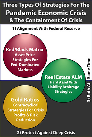
This well proven use of gold to effectively hedge against Fed failure and secular bear markets in financial assets is represented by the golden circle in the dark bottom half of the graphic above. One fundamental strategy for the pandemic economic crisis is to invest a portion of one's assets to protect against a deepening of the crisis (ideally in a ratio and/or rebalancing strategy that that has historically greatly reduced the risks while still keeping much of the upside).
However, there is an entirely different fundamental strategy - that interestingly enough has been almost exactly as effective as gold since the pandemic breakout occurred. This strategy is represented by the lighter half, that of alignment with the Federal Reserve, and the red circle.
The philosophy behind that strategy is that if the financial system has moved to a place where all the markets are dominated by Federal Reserve interventions and monetary creation - as they have, even before the pandemic but particularly since then - then investors should seek to understand how asset prices move in response to Fed actions, and position themselves accordingly. The objective here is to align one's assets with the real situation, and to benefit from how the Fed distorts the markets.
This type of strategy is the main core of the free book, and as I plan to explore in my next analysis, one aspect of that strategy of alignment - that is based on the direct opposite of a gold-based strategy - has produced highly desirable results in recent months that are remarkably close to those produced by gold.
Learn more about the free book.
********************************************
Much more information about the three very different types of strategies for the pandemic economic crisis and the attempted containment of crisis is linked here.