

Chapter Seven
Using The Five Graphs To See The 1-2-3 Cycle Of Exaggerated Profits & Losses
By Daniel R. Amerman, CFA
TweetIn Chapter Three (linked here), we explored five graphs that showed five factors which in combination have transformed single family home prices over the last almost 20 years. That analysis is a core analysis of this series, and is well worth studying for anyone who is interested in housing and other real estate values, either as an investor or homeowner.
What we explored is a counter-intuitive relationship for most people - how "bad news" in terms of the containment of a major crisis, can create "good news" in the form of record new investment prices and record new profits. Our focus was on the years between 2000 and 2006, as shown with the red numeral "1" in the graph below. The step by step analysis used the five graphs to show how extraordinary interventions by the Federal Reserve logically led to huge price gains in real estate, creating the first towering golden spike that exceeded the previous outer boundaries for inflation-adjusted home prices by a factor of about 6X.
In this analysis we will use the five graphs to explore the years represented with the red numerals "1", "2", and "3" above, which cover the entire period between 2001 and 2017. We will first use the graphs to explore how the stage was being set for "2", an eventual record breaking plunge in real estate prices, even while real estate prices were still soaring during the "1" portion of the cycle. We will then go through the five graphs again, and see what created "3", the next rapid asset appreciation portion of the cycle and the second towering golden spike of exceptional home prices (which, as can be seen, bears an almost uncanny resemblance to the first spike).
In sequence, as we move from "1" to "2" to "3", we will gain a much better understanding of: 1) what caused the largest potential real estate profits on a national basis in the modern era; 2) what caused the largest potential real estate losses in modern times; and 3) what caused a second round of some of the largest potential real estate profits in the modern era.
The last twenty or so years have been dominated by this 1-2-3 cycle, with profits, losses and a degree of volatility that do not have a prior historical equivalent in the United States. The next twenty and more years may very well also be dominated by similar factors, and for investors who wish to be prepared for the heightened profit opportunities - as well as the heightened risks - there is simply no substitute for understanding what has caused each stage of the 1-2-3 cycle.
This analysis is the seventh chapter in a free book, an overview of the rest of the book is linked here.
Graph 1: Fed Funds
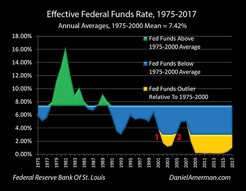
As explored in the previous analysis and shown in the area near the red numeral "1", the Fed responded to the collapse of the tech stock bubble and then the following recession of 2001 by slashing interest rates in order to contain the crisis and to help stimulate an economic recovery. Interest rates were pushed down from 6.40% in December of 2000 to 0.98% in December of 2003.
In the years before that recession, above average Federal Funds rates are shown in green, and below average rates are shown in blue. When the Fed smashed interest rates downwards, it did so with such force that it pushed rates to their lowest level since 1954, far surpassing the lowest interest rates of the previous decades, and creating the golden outlier zone.
However, rates did not stay low, but rather they bottomed in 2003, and the Fed began swiftly raising rates again. As can be seen in the graph near the red numeral "2", as part of its exiting the containment of crisis policies, the Fed increased rates almost as fast as they had earlier decreased them, raising them by 4.25% between 2004 and 2006. This pushed Fed Fund rates right out of the golden outlier zone and well into the blue zone, albeit still well below the historic average.
So when we look at the cycle phases, we saw a complete reversal: 1) in phase #1 as part of the containment of crisis the Fed forced short term interest rates to their lowest levels in almost 50 years, and then 2) as part of phase #2 of exiting the containment of crisis, the Fed then reversed its interest rate cycle and sent interest rates rapidly upwards to more normal levels, leaving the outlier range.
Graph 2: Yield Curves
As explained in the analysis linked here, a yield curve "inversion" just means that short term interest rates become higher than long term interest rates - and when this has happened in the modern era, inversions have been a perfect warning indicator that a recession is about to follow.

The graph above shows the difference between yields on the 10 year Treasury and the 2 year Treasury. When the yield curve is normal, subtracting short term yields from long term yields produces a positive number, which is represented by the blue area on the graph. When the yield curve is inverted, a negative number is produced, which is represented by the infrequent golden areas that go below the 0.00% line. Each of the three golden areas of inversion above are indeed relatively quickly followed the by red areas representing economic recessions.
The yield curve inversion of 2000 was followed by the recession of 2001, and when the Fed knocked interest rates down in response - it produced an extraordinary positive increase in the yield curve, with long term rates greatly exceeding short term rates, and the fast explosion upwards in the blue area of the graph that is identified with the red numeral "1".
The blue area of the positive yield curve peaked in 2003 - along with the bottom in Fed Fund rates - and when the Fed began the increasing interest rate portion of its cycle (as shown with "2" on the Fed Funds graph), it triggered an opposite cycle for the yield curve. The yield curve collapsed almost as quickly as it had climbed, with short term rates rising much faster than long term rates, until by 2006 the yield curve had once again inverted, and we have the return of the golden inversion area as identified with the red numeral "2" on the Yield Curve graph.
The extremely fast positive increase in yield curve spreads during the cycle of the rapid lowering of Fed Fund rates is one aspect of cycle phase #1, the containment of crisis. The almost equally fast collapse in yield curve spreads during the cycle of the rapid increasing of Fed Fund rates - and the eventual inversion - are aspects of cycle phase #2, exiting the containment of crisis.
As developed in much greater detail in the previous analysis in this series (linked here), a quite deliberate exogenous intervention from the Fed, for reasons that were not a "random walk" and that had nothing to do with real estate specifically, created the factors which inverted the yield curve and produced the perfect warning indicator signal in the exact same year that real estate prices were peaking. This created a "poisonous seed", in that the same fundamental factors that were creating peak real estate prices were simultaneously warning of the recession that would follow.
Now, in the euphoria of peak real estate prices and elevated stock market prices that characterized the years 2005 and 2006, most investors would have dismissed the idea of a "poisonous seed" and approaching recession and crisis as being totally out of synch with the extraordinary creation of wealth that was all around them. (Much as tech stock investors would have completely dismissed the yield curve inversion of early 2000.)
But nonetheless, the golden area of yield curve inversion identified with "2" above, would indeed be followed by the red area of recession (and financial crisis), just as it had in previous economic cycles, but with a degree of losses that exceeded what had been seen in previous cycles.
Graph 3: Mortgage Rates
Fixed rate mortgages carry long term interest rates, and 30 year fixed rate mortgages are usually priced at a spread above the yield on 10 Year US Treasury bonds. So to understand changes in mortgage rates, we need to include both of the previous graphs of Fed Funds rates and Yield Curve changes.
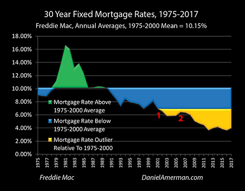
In response to the tech stock bubble collapse and the resulting recession, the Fed smashed short term interest rates deep into the golden outlier range as its core tool in cycle phase #1, the containment of crisis. However, the degree of movement was far less with mortgage rates than it was with Fed Funds rates, as can be seen by comparing the area near number "1" in the Mortgage Rates graph above, with the graph area near number "1" in the Fed Funds graph.
The difference is another aspect of the containment of crisis, where the explosion upwards of yield curve spreads as seen in the blue area near number "1" in the Yield Curve graph temporarily absorbed much of the force of the abrupt movement in short term yields, keeping them from fully impacting long term yields. Even after this absorption effect, mortgage rates still moved into the golden outlier territory, a range that had not been seen during the 1975 to 2000 era, but the degree of movement was much less than what was seen with Fed Funds.
When the Fed reversed the cycle to phase #2, exiting the containment of crisis, then we again have two components moving in combination and against each other - but the directions reversed as well . When the Federal Reserve sent the Fed Funds soaring upwards towards more historically normal levels and rapidly leaving the golden outlier zone ("2" on the Fed Funds graph), then the blue area of yield curve spreads collapsed downwards ("2" on the Yield Curve graph) at the same time.
On a combined basis during the phase #2 exiting the containment of crisis years, the changes in the yield curve absorbed most of the impact of the Federal Reserve interest rate decreases, preventing the changes in short term rates from increasing mortgage rates and thereby mortgage payments (for a given home price). However, perhaps even more importantly, the changes in yield curve spreads did keep mortgage rates from leaving the golden outlier range, as can be seen in the in the area near the number "2" in Mortgage Rates graph, meaning that mortgage rates have remained outside the 1975 to 2000 range continuously since 2001.
The cyclical relationship between short and long term interest rates and how it responds to cyclical changes in Federal Reserve monetary policy may sound deeply obscure to the average individual homeowner, real estate investor or retirement investor. But nonetheless, when we look at the relationship between "1" and "2" on the Mortgage Rates graph above, what we can see is arguably one of the most critical reasons why the real estate bubble grew as large as it did, and when and why it popped with catastrophic consequences. This relationship may also prove to be one of the most important determinants of whether history repeats itself in the real estate market over the next several years.
(As covered in the previous analysis, when we go to the next level of detail there are also the considerations of fluctuations in the spread between Fed Funds rates and 2 year Treasuries, as well as changes in the spread between mortgage rates and 10 year Treasuries. That said, the differences between short term and long term yields in general as explored herein do account for most of the relationship.)
Graph 4: Mortgage Payments
For most homeowners and investors it is not housing prices that determine affordability, but rather mortgage payments.
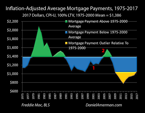
As shown with in the inflation-adjusted Mortgage Payments graph above, when we combine average annual national home prices and average annual mortgage rates, we get the green and blue areas of above and below average mortgage payments relative to the 1975 to 2000 average mortgage payment of $1,386 (in 2017 dollars).
Unlike the Fed Funds rate and Mortgage Rate graphs - no golden outlier area was created in the Mortgage Payments graph near the red numeral "1" as part of the containment of crisis in 2001 and the immediately following years. What was happening was that the golden outlier of the stunning surge in housing prices was being entirely offset by the golden outlier of the lowest mortgage rates in the modern era.
As covered in much more detail in the previous analysis, the initial plunge in Fed Fund rates brought mortgage rates low enough to reduce average mortgage payments in 2001 and 2002 during the containment of crisis phase of the cycle, even while home prices were rising fast.
However, what was much more impressive - and financially significant - was the fast collapse in yield curve spreads that contributed to a "free money" situation in 2004 and early 2005. These were the early years of the next phase of the cycle, that of exiting the containment of crisis.
Even while both Fed Funds rates and home prices were climbing fast together, the yield curve moving in the opposite direction was keeping mortgage rates low enough that inflation-adjusted mortgage payments stayed below average. This meant that homes remained remarkably affordable by historic standards even while the prices on those homes were soaring to 2X, 3X and then 4X their previous outer bounds relative to long-term historic averages.
In the latter stages of the exiting the containment of crisis phase of the cycle, as the blue area in the Yield Curve graph began running out of room to drop over the course of the year 2005, before bottoming out in the inversion of 2006 - the "free ride" ran out for the housing market and the "free money" came to an end. For the first time mortgage payments rose above the historical average, as can be seen with the green area of the graph near the red numeral "2".
When the Fed initially moved the cycle to containing crisis and smashed interest rates down, it strongly supported the growth of housing prices. When the Fed later moved the cycle to exiting the containment of crisis and began to rapidly increase interest rates, it also set in motion a "time bomb" of sorts when it came to mortgage payments and housing prices, that is separate from the "poisonous seed" discussed in the Yield Curves section.
Yes, the collapse in yield curve spreads that is part of exiting the containment of crisis would indeed insulate the housing market from the Fed's actions - for a time. This would allow housing prices to continue to rapidly climb to new heights while mortgage payments remained historically affordable - for a time.
But, collapsing yield curves have a built in "expiration date" as they can only fall for so long before they go to zero and then perhaps invert. They then lose their ability to shield the housing market from the impact of interest rate increases. This then leaves the housing market at a vulnerable and highly elevated level, even as mortgage payments begin a rapid climb, swiftly reducing the affordability of the housing at the elevated prices.
And again - entirely separately, the same underlying fundamental factors that create yield curve inversions began to powerfully forecast a coming recession, at what may have seemed to be the worst possible time for an elevated housing market that was suddenly quite vulnerable to affordability issues (even without a potential looming recession). With what may seem to be the worst possible bad luck being not random, but being baked into the #2 cycle phase of exiting the containment of crisis right from the beginning.
While little noticed, these somewhat obscure elements of the overall cycle of crisis and the containment of crisis may also have great relevance for today. As the yield curve again nears a potential inversion, it isn't just that a potentially potent recession warning signal may be about to be triggered again. Even more fundamentally, the "expiration date" is rapidly approaching when it comes to the yield curve no longer having the room to continue to at least partially insulate the currently quite elevated housing market from the Fed's policy of increasing interest rates as part of the current cycle of exiting the containment of crisis.
Home Prices & Cycle Phase #1 - The Containment Of Crisis (Graph 5)

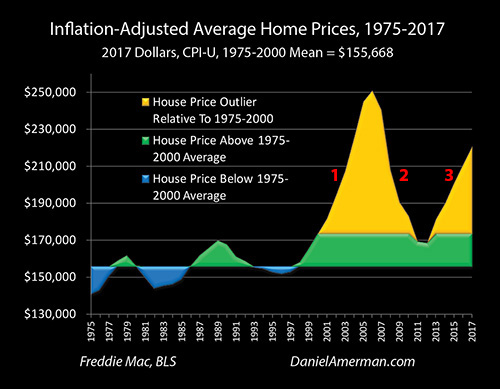
In the inflation-adjusted Home Prices graph above we see two features - labeled "1" & "2" that simply should not exist according to the widely accepted belief systems that drive the investment decisions of the great majority of individual investors.
If we looked at the historical range for home prices and expected them to continue, as explored in detail in the analysis linked here - then we had a complete model failure.
Before the Federal Reserve knocked Fed Funds rates down to almost 50 year lows as part of the containment of crisis - single family home prices were a remarkably stable investment on an inflation-adjusted basis, cycling up and down around a mean, with the above average prices shown in green and the below average prices shown in blue. These up and down movements fell in a range of no more than about +/- 10% relative to the mean, and whenever prices got too high or low relative to that mean, whenever they neared the outer boundaries, then "reversion to the mean" would take over and guide them right back.
During the 2001 to 2006 period (#1 above), the United States single family housing market completely broke out of the historical ranges and patterns to an extraordinary degree, reaching a level of more than 60% above the mean, or about 6X the previous upper bounds of the price range. During the 2007 to 2011 period (#2 above), housing prices fell by 53% (relative to the 1975-2000 mean), which was about 5X the previous lower bounds for price movements.
These extreme and volatile price movements might seem a like bizarre aberration - unless we use the Five Graphs and examine them within the context of cycles of the containment of crisis and exiting the containment of crisis.
When we look at the powerful move downwards in Fed Fund rates and the major movement into the golden outlier range (#1 on the Fed Funds graph) that were part of the containment of crisis phase, and we adjust for the rapid expansion of yield curve spreads (#1 on the Yield Curve graph) that was also part of the containment of crisis phase of the cycle, then we get the lesser movement into the golden outlier range for mortgage rates (#1 on the Mortgage Rates graph).
When we combine the golden outlier of mortgage rates with the golden outlier of home prices (#1 on the Home Prices graph), then as part of the containment of crisis phase of the cycle, we got the "free money" of consistently below average inflation-adjusted mortgage payments (#1 on the Mortgage Payments graph).
When it came to what determines what truly matters for most people in terms of how much house they afford to can buy - which is not the price, but what they have to pay each month - the exogenous interventions by the Federal Reserve as part of the containment of crisis was so powerful that there was no upwards spike on a historic basis. Indeed, so powerful were the combined effects of the factors explored in the Five Graphs that mortgage payments were almost continuously below average on an inflation-adjusted basis, right up until almost the end. There was no historic bubble in what people were paying every month.
As explored in the previous analysis, there were many other factors that contributed to the growth - and collapse - of where there was a bubble, which was in real estate prices. But the growth in the excesses were enabled by the very fertile environment in which they existed, a "Petri dish" of sorts. This Petri dish was the containment of crisis, and the factors captured in the Five Graphs producing an environment where average homeowner mortgage payments were continuously below average even as home prices reached their historic outlier as a percentage above the mean, then 2X that outlier, then 3X that outlier, and then 4X that outlier.
The greatest potential real estate profits in the modern era were not an aberration or the results of a "random walk", but were the logical and rational results of the containment of crisis phase of the cycle, and the most heavy-handed interest rate interventions by the Fed in the modern era - up to that date.
Home Prices & Cycle Phase #2 - Exiting The Containment Of Crisis
The containment of crisis and record real estate prices were not a destination, but a phase in the cycle. The next phase in the cycle was exiting the containment of crisis, which meant over time withdrawing the interventions that had created the fertile environment that supported the high prices.
This next phase - which would ultimately sharply reduce housing prices - began long before the peak in real estate prices was reached. The Federal Reserve set the process of exiting the containment of crisis in motion by beginning a cycle of sharply increasing Fed Funds rates about halfway through 2004 (#2 in the Fed Funds graph).
Yield curve spreads reversed direction and immediately began to move downwards at a precipitous rate as part of this new phase of exiting the containment of crisis - and this also occurred years before the eventual peak in real estate prices. By February of 2006, yield curve spreads would begin their inversion (#2 in the Yield Curve graph), and would lose their ability to insulate mortgage rates from changes in short term rates, even while quite accurately warning of the recession that would follow in a little less than two years.
The "buffering" provided by swiftly falling yield curve spreads in the early stages of exiting the containment of crisis would allow mortgage rates to remain at near historic lows on an annual average basis through 2004 and 2005 (#2 in the Mortgage Rates graph), long after the Fed had begun to increase short term rates. This ran out in 2006 as the yield curve inverted, and mortgage rates moved upwards even while housing prices were peaking and the oncoming recession was being signaled.
While mortgage rates were kept fairly stable during 2004 and 2005 by decreasing yield curve spreads, fast rising home prices were creating slowly increasing mortgage payments during this time of exiting the containment of crisis, albeit still below historically average through 2004. However as housing prices peaked even while mortgage rates lost their insulation - the "free money" that had enabled the explosive increase in housing prices was lost, and mortgage payments moved well into the above average range by 2006 (#2 in the Mortgage Payments graph).
Step by step and over a period of about two years, the phase of exiting the containment crisis removed each of the supports that had enabled the unprecedented increase in housing prices during the containment of crisis phase of the cycle. Until housing prices were left at a precipitous height, even as rising mortgage rates contributed to rising mortgage payments that were quickly creating affordability problems for home purchasers, even as yield curve spreads lost their protective abilities while simultaneously accurately signaling the recession that would begin within two years.
Now, this analysis is not meant to imply that the phase of exiting the containment of crisis was the sole cause of the precipitous later decline in real estate prices, or the Financial Crisis of 2008, or the Great Recession that followed. There were many intertwined failures and excesses that set up the crisis - but what they all had in common was that they were allowed to grow in the very fertile and forgiving environment of continuous new records in real estate prices.
As these speculative excesses were reaching their peak - the ground was already being cut out from underneath them by the cycle of exiting the containment of crisis. Indeed, as explored in this analysis, years before the beginning of the swift decline in real estate prices that would trigger the mortgage derivatives losses that would create the Financial Crisis of 2008 - the fundamental economic and financial forces that would collapse the irrationalities and the excesses were already developing in plain sight, as captured in the Five Graphs.
The greatest real estate losses of the modern era (#2 on the Home Prices graph) were not an aberration or the results of a "random walk", but were ultimately the logical and rational result of the exiting the containment of crisis phase of the cycle, as part of a process that had been underway for years before the losses began.
Explaining The Second Spike (#3 On The Five Graphs)
Of course, there are many, many explanations that have been offered for what caused the Financial Crisis of 2008 and the Great Recession. Most of those essentially say that it was a one-time aberration. However, if we confine ourselves to just the unprecedented spike upwards in real estate prices and the subsequent plunge downwards, then we run into a major problem with the "one-time aberration" theory.
Why is there a second spike?
Why is there not just a second spike, but as seen with #3 above - why does it look almost identical (so far) to the #1 half of the first spike?
The first spike clearly completely shattered the blue and green patterns of the former housing market, where prices reliably oscillated up and down on an inflation-adjusted basis within about a range of about +/- 10% of the mean. If the first spike was indeed a one-time aberration, then it would really seem to stretch the limits of plausibility to say that another complete aberration that just happens looks exactly like it is by pure coincidence following right behind it.
Doesn't it?
There is an alternative explanation that is explored in the analysis sections that follow, which is that of a repeating cycle, where 1) the containment of crisis is followed by 2) exiting the containment of crisis, which is then followed by 3) the containment of crisis.
Now, with that explanation, there should be a #3 that follows, and it should indeed resemble #1. With the most interesting information value of all coming in when we think about what those cycles may be able to tell us about opportunities and dangers in the years to come.
Graph 6: Fed Funds

In the first phase of the cycle (#1 above), that of the containment of crisis following the tech stock bubble collapse and the subsequent recession, the Federal Reserve reduced effective Fed Funds interest rates down from 6.40% in December of 2000 to 0.98% in December of 2003, which was a decrease of about 5.50% (to the nearest 0.25%). This produced a golden outlier zone, and the lowest interest rates since 1954.
In the second phase of the cycle (#2 above), that of exiting the containment of crisis, the Fed increased Fed Funds interest rates from 1.04% in June of 2004 to 5.24% in July of 2006, which was an increase of about 4.25%. This took Fed Funds entirely out of the golden outlier range, albeit still well below the historical average.
In the third phase of the cycle (#3 above), as part of the containment of the crisis of 2008 and the resulting Great Recession, the Federal Reserve reduced effective interest rates from 5.26% in July of 2007 to 0.16% in December of 2008, which was a reduction of about 5.25% (in terms of the target boundaries). This produced the lowest interest rates in the history of the Federal Reserve, and these rates would persist for many years.
Graph 7: Yield Curves
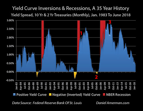
The recession of 2001 followed the yield curve inversion of 2000, and when as part of the containment of crisis the Federal Reserve rapidly lowered interest rates in response, the yield curve spread between 2 and 10 year Treasuries soared upwards from -0.40% in August of 2000 to +2.01% by January of 2002 (#1 above), which was an increase of about 2.4%.
When the Fed rapidly raised interest rates in the next phase of the cycle as part of exiting the containment of crisis, yield curve spreads fell from a peak of +2.58% in August of 2003 to a floor of -0.15% in November of 2006 (#2 above), which was a decrease of about 2.75%. This yield curve inversion would be followed by the Great Recession, as can be seen with the red band above.
When the Federal Reserve lowered interest rates to historic lows in the next phase of the cycle and as part of the containment of the crisis of 2008, the yield curve spread widened from a low of -0.15% in November of 2006 to a peak of 2.83% by February of 2010 (#3 above), which was an increase of about 3.0%.
Graph 8: Mortgage Rates

As part of the containment of crisis from the popping of the tech bubble and the recession that followed, 30 year mortgage rates fell from 8.64% in May of 2000 to 5.21% by June of 2003 (#1 above) during that phase of the cycle, which was a decrease of almost 3.5% (weekly data from the Freddie Mac Primary Mortgage Market Survey). While much of the larger decrease in Fed Funds rates was absorbed at least temporarily by the increase in yield curve spreads that occurs in that phase in the cycle, enough still passed through to the mortgage market to push interest rates into the golden outlier range, meaning the lowest in the modern era.
During the exiting the containment of crisis stage of the cycle that followed, the great majority of the 4.25% increases in Fed Funds rates were absorbed by the decreases in the yield curve spread, until the yield curve inverted and ran out of room to absorb interest rate increases. So there was an increase in mortgage rates in this stage of cycle (#2 above), with rates rising from 5.53% in June of 2005 to a peak of 6.80% in July of 2006, which was an increase of about 1.25%.
Crucially, this meant that on the annual average basis that is shown in the Mortgage Rates graph above, mortgage rates stayed continuously in the golden range of historical outliers relative to the 1975 to 2000 period.
When the Fed rapidly decreased the Fed Funds rate in the next phase, the containment of the crisis of 2008, the extremely rapid increase in yield curve spreads would again temporarily insulate mortgage rates from most of the change. But nonetheless, the historically unprecedented Fed Fund rates would lead to a decrease in annual average mortgage rates to 5.04% by 2009 (#3 above), which was outside of both the 1975 to 2000 range, and the range of the previous containment of crisis.
This new and lower range would persist for the next eight years, and 30 year mortgage rates would indeed fall quite a bit further, down to annual averages of 3.66% in 2012 and 3.65% in 2016, not as a result of changes in the Fed Funds rates, but because of the decreases in the blue area of yield curve spreads that can be seen in the Yield Curves graph.
Graph 9: Mortgage Payments

During the containment of crisis stage in the years 2001 and 2002, average inflation-adjusted mortgage payments were decreasing (#1 above) - in spite of the rapid spike upwards in inflation-adjusted housing prices that can seen in the Home Prices section that follows.
Mortgage rates being knocked down into the golden outlier range made mortgage payments so affordable that they became a form of "free money" - housing prices could soar upwards in this phase of the cycle, radically exceeding historical norms, and yet the home purchasers never really had to pay the price, as their monthly payments remained well below average.
In the exiting the containment of crisis stage that followed, the impact of decreasing yield curve spreads mostly offsetting the effects of increasing Fed Funds rates was enough to moderate and slow down the increase in mortgage payments, but not enough to completely offset the extraordinary increases in real estate prices.
So, even with mortgage rates remaining in the historical outlier range, there was an increase in average monthly mortgage payments from a below average $1,221 in 2003 to an above average $1,571 in 2006 (#2 above). To a slight extent in 2005, and to a much greater extent in 2006, homeowners were now finally having to come up with actual increased cash out of their paychecks each month in order to buy homes at what were now stratospheric prices on a historical basis.
When the financial crisis of 2008 hit, and the cycle turned back to the containment of crisis, then mortgage payments plunged downwards, as the two factors that had driven payments upwards both went through a rapid reversal. Home prices rapidly decreased even while the Federal Reserve was rapidly decreasing Fed Funds rates.
Inflation-adjusted mortgage payments averaged only $1,028 in 2009, which was a historical outlier that crossed into the golden area (#3 above), lower than anything seen not only in the 1975 to 2000 era, but also in the earlier cycle of the containment of crisis (#1 above). This was true even despite the containment of crisis driven surge in yield curve spreads which would (temporarily) blunt much of the sharp decrease in Fed Funds rates.
By 2012, four of the graphs were moving in combination. The Fed Funds remained at historic lows, deep in the historic outlier range. Home Prices bottomed out. Yield Curve spreads dropped about in half relative to their peak. This decrease in yield curve spreads drove Mortgage Rates to a new historic low, deep in the golden outlier range and far below either the 1975 to 2000 era, or the bottoms reached in the previous containment cycle.
The four graphs together produced the fifth graph of Mortgage Payments - and the results were spectacular. Inflation-adjusted national average mortgage payments fell to $771 per month in 2012.
A fascinating thing about inflation and prices over time is that they are so inherently deceptive that even when a financially and economically educated person thinks that we fully "get it" - we often don't. The nominal (not adjusted for inflation) national price for an average home (with average 2017 size and amenities) in 2012 was $157,606. The average nominal price for an equivalent home in 1980 was $52,534. or less than 1/3 as much. (Because average homes were smaller in 1980, the actual average price for homes at that time was lower.)
This is where an economically astute person goes "OK, inflation over the long term creates an illusion of 3X the value, I get that."
But if we look at what matters when it comes to affordability for most home owners, the real cost of making that monthly payment, then the cost of home ownership was plunging and becoming by the far the cheapest it had ever been in most people's lifetimes. Mortgage payments in 2012 were less than half of average mortgage payments of $1,571 in the year 2006, and were only a little more than a third of the 1981 peak of $2,089 a month.
On an inflation-adjusted basis, mortgage payments fell to 68% of the historical average (1975-2000) in 2010, 61% of the average in 2011, and 56% of the average in 2010, as can be visually seen in the broad golden spike downwards (#3 above). Even as some people were swearing off home ownership altogether, the whole nation was going through what was the biggest "blue light special" on homeownership that it had ever seen. All across the United States, when we take home prices, mortgage rates and inflation into account together, the average monthly cost of homeownership was being marked off by almost 50% compared to long term averages.
Now, this reality of an (almost) 50% off sale on homes bought with mortgages was difficult for many even economically astute people to see, with all those home prices that were nonetheless still above $150,000, and with the much higher prices that were still prevalent in some of the coastal metropolitan areas in particular. With the most interesting part of all being, as can be seen in the Home Price graph below - house prices were indeed still solidly above average. Even at the bottom of the trough in 2011 and 2012, the very lowest home prices since before 2001, inflation-adjusted prices were still very close to the top of the above average green historical range, and almost into the golden outlier range.
And what is it that created this extraordinary and seemingly unlikely situation, where mortgage payments were on sale, at almost 50% off, creating what was by far the most affordable home purchase environment the nation had seen - even while housing prices themselves were still close to the top of the historical range?
It was the application of pure, raw power in the containment of crisis phase of the cycle (#3 above).
It was the Federal Reserve - in a calculated and deliberate application of policy that followed its playbook for containing crisis and was in no way a "random walk" - forcing short term interest rates sharply lower. The difference this time was that the Fed forced interest rates downwards to unprecedented levels, and in the process and as explored via the Five Graphs, it also moved mortgage rates, mortgage payments and home prices to a place that in combination had never been seen before.
Home Prices & Cycle Phase #3 - The Containment Of Crisis (Graph 10)
The increase in housing prices that would occur as a result of the containment of crisis was not immediate. The Federal Reserve began a slow cycle of decreasing interest rates in late 2007, and quickly moved to panic mode and far more rapid decreases in Fed Funds rates in early 2008. Home prices were already far down by that point as a result of the previous exiting the containment of crisis phase of the cycle, and the average for the year 2008 would roughly equal average prices for 2003, meaning that peak gains of 2004, 2005 and 2006 were all gone.
The Financial Crisis and the Great Recession each contributed to the malaise, along with the explosion in foreclosures, the psychology of home ownership changed for many people, and home prices would continue to fall through 2009, 2010 and 2011 - until a floor was reached, that would last into 2012.
What is fascinating about that floor - is just how high it was. Looking at the price cycles before 2001, each time market prices got above average (the green area) and started going down - they went right through average and kept going down into below average range (the blue area).
Now in the midst of what were considered to be the worst economic times since the Great Depression, in a savaged and reeling housing market that was being flooded with home foreclosures, even while loan underwriting and equity requirements were whipsawing to a degree of strictness that was far worse than they had been before 2001 - it would seem reasonable to expect that national average home prices might just go to levels that were at least a teensy little bit below average.
But, home prices never even returned to close to average, because of the extraordinary power of the factors that we have been exploring via the Five Graphs.
As we just reviewed, during the phase #3 containment of crisis all four of the other graphs were working the same way that they were during the phase #1 containment of crisis - except that they were often in amplified form.
Fed Funds rates were smashed down by about 5.50% in phase #1, and smashed down by about 5.25% in the phase #3 containment of crisis. The difference was that starting point was lower, so Fed Funds rates went not to a 50 year low, but an all time low.
Yield curve spreads moved from inversion to up about 2.4% in phase #1, and from inversion to up about 3.0% in the phase #3 containment of crisis.
Average annual 30 year mortgage rates moved into the historical outlier range (relative to the 1975-2000 period) during phase #1, and averaged roughly 5.85% between 2003 and 2005. Average mortgage rates moved much deeper into the historical outlier range during the phase #3 containment of crisis, averaging about 4.25% between 2009 and 2015.
During phase #1 of the containment of crisis, mortgage payments stayed well below average until 2005, allowing "free money" to send home price increases up in excess of 4X their previous range boundaries, without financially penalizing home buyers relative to historic averages. As extensively covered in the previous section, during phase #3 of the containment of crisis the other factors combined to create an almost "50% off sale" by 2012, where home prices could begin a rapid climb financed by mortgage payments that were so cheap they were entirely beneath the previous historical range even while home prices were fast climbing into a zone that was entirely above the previous historic range (of 1975-2000).
There is an almost exact correspondence in the Five Graphs between what happened in each of the cycles of the containment of crisis. The Fed did a massive interest rate intervention to contain crisis to a degree that had not previously been seen in the modern era, this filtered through cyclical yield curve spread changes to determine mortgage rates, and the mortgage rates for any given home price level determined the affordability of mortgage payments. The end results were the fifth graph of inflation-adjusted home prices, and instead of a one-time aberration we see two spikes of home price gains, each of which shatter the prior historical patterns even while displaying an almost uncanny similarity to each other.
Now, the past never exactly repeats itself, and there are certainly differences of degree between the two cycles of the containment of crisis. The problems were much greater in the aftermath of the Financial Crisis than they had been in the wake of the popping of the Tech Stock bubble. The Fed's interventions were more extreme, which led to more extreme results in the graphs. But the end result was the same in each case - extraordinary profits for real estate investors that were outside of the prior historic range.
The second round of the greatest potential real estate profits in the modern era was not an aberration or the result of a "random walk", but was the logical and rational result of the containment of crisis phase of the cycle, and the most heavy-handed interest rate interventions by the Fed in its history.
(Long-time readers will recall that 2012 was the year of my "Overcoming Monetary & Political Risk" workshops and DVDs, where I proposed the strategy of "Alignment" with the interests of the Fed as being the best way of investing in markets dominated by Federal Reserve interventions, and made the case that the single best way to profit from the Fed was to purchase single family homes.)
The Extraordinary But Counter-Intuitive Wealth Implication Of The 1-2-3 Cycle
As stated in the introduction, our goal in this analysis was to use the Five Graphs to move from "1" to "2" to "3", and gain a much better understanding of: 1) what caused the largest potential real estate profits on a national basis in the modern era; 2) what caused the largest potential real estate losses in modern times; and 3) what caused a second round of some of the largest potential real estate profits in the modern era.
Hopefully, the reader now understands the use of the Five Graphs and has gained new and useful perspectives on: how the #1 cycle phase of the containment of crisis created extraordinary price gains; how the #2 cycle phase of exiting the containment of crisis removed the supports underlying the price gains and set the stage for unprecedented losses; and how the following #3 cycle phase of the containment of crisis created a second round of extraordinary price gains with an almost uncanny resemblance to the first round.
Unfortunately, much of this information is quite difficult for most people to understand, because it just seems to be completely upside down. Simply put, the way that most people see the world is that good news is supposed to create big profits and bad news is supposed to create big losses.
Yet, as analyzed in detail herein, what phase #3 shared with phase #1 is that the two greatest bull markets in real estate that we have seen in our lifetimes were each the logical end results of what was initially terribly "bad news" in terms of market crashes and economic recessions.
This is deeply counter-intuitive for the average investor. But the times have indeed changed, and to not understand the rational reasons for this seemingly upside down fundamental relationship - and its powerful effects on not just real estate but also stocks, bonds and precious metals - is to arguably be completely blind what have been the sources of the largest profits and losses that we have seen to date.
What makes this of particular importance is that these cycles have not ended.
As of 2018, all of the Five Graphs are actively in motion as the 2nd golden spike of inflation-adjusted home prices is still headed upwards, even as the Fed in the effort to exit the containment of crisis continues the most aggressive cycle of increasing Fed Funds rates seen since the first half of 2006, even while mortgage rates and mortgage payments continue to rise, and even while the yield curve nears its first possible inversion since 2006.
The easiest way to use the information herein is to ask whether cycle phase #4 is in process, when it is likely to happen, and to what extent is the #4 phase is likely to resemble the earlier #2 phase of exiting the containment of crisis?
Those are obviously some very important questions that could have major and even life changing implications for many millions of people.
However, while the ability to see and understand cycle phase #4 could be extremely useful, let me suggest that there is something else that could be even more important: can we think about whether #5 will follow #4?
Will cycle phase #4, another round of exiting of the containment of crisis, be followed by cycle phase #5, another round of the containment of crisis? When might that happen, what is different this time around, and what might it look like?
If we understand in advance that for reasons that are not aberrations or a "random walk", two of biggest price swings in our lifetimes could in sequence still be on the way - what can we do with that information? Can we use that information to protect ourselves? Are there ways that we can turn those insights to our financial advantage?
This is another quite ambitious analysis, in what has been a series of ambitious analyses. I do hope that the reader is now seeing and thinking about not just cycle phase #4 - but also about cycle phase #5, and how the two could work in sequence. When we think it through - there are some fascinating implications when it comes to both "offense" and "defense".
The 1-2-3 Cycle & The Red/Black Matrix
In terms of the Red/Black matrix developed in other analyses in this series, this current analysis can be placed in the "B", "D" and "C" columns.
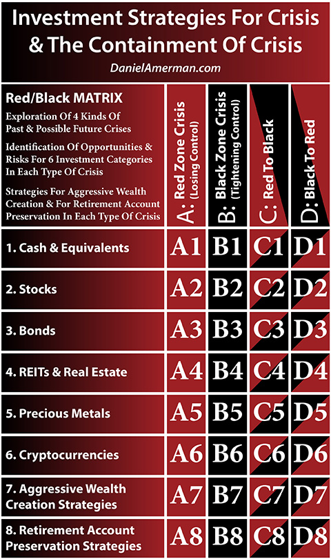
(Red/Black matrix pdf link here.)
The columns are the cycles themselves, and cycle phase #1 is the Black column "B", the containment of crisis.
The cycle phases transitioning from #1 to #2 (and the accompanying major price swings) is the Black to Red column "D", the cyclical movement from the containment of crisis to crisis.
The cycle phases transitioning from #2 to #3 (and the accompanying major price swings) is the Red to Black column "C", the cyclical movement from crisis to the containment of crisis.
The rows are the specific investment categories, and the often quite different impacts of cyclical changes on each category.
Because the focus of this analysis is real estate, which is the 4th row, the applicable matrix cells are B4, D4 and C4. Using the Five Graphs, we examined single family housing prices and the containment of crisis (B4, i.e. Black), the impact on housing prices of the move from the containment of crisis to crisis (D4, i.e. Black to Red), and the impact on housing prices of the move from crisis to the containment of crisis (C4, i.e. Red to Black).
Rows 1-3 and 5-6 examine the impact of the same cycles on the other investment categories. For example, stocks are the 2nd row, and stocks and the containment of crisis is matrix cell B2. The impact on stocks of the move from the containment of crisis to crisis is D2 (Black to Red), and the impact on stocks of the move from crisis to the containment of crisis is C2 (Red to Black).
Using all of the information from the first six rows of the investment categories for a particular column (cycle phase or phases), the 7th row explores which investment categories to seek and which to avoid (and in what sequence) for an aggressive investor who is trying to maximize cyclical gains, and is willing to take some significant risks in the attempt to do so.
Using all of the information from the first six rows of the investment categories for a particular column (cycle phase or phases), the 8th row explores which investment categories to seek and which to avoid (and in what sequence) for more defensive investors, such as retirement account investors who are primarily focused on trying to avoid major cyclical losses, while still opportunistically attempting to pick up those cyclical gains that may be available on a more reduced risk basis.
*******************************