

The Sixth Graph - The Multiplication Of Wealth
By Daniel R. Amerman, CFA
TweetIn the previous analyses, we used the Five Graphs and inflation-adjusted numbers to identify and understand what has been creating the 1-2-3 cycles of major home and real estate price changes over the past almost 20 years.
In this analysis we add back in a sixth factor, that of inflation, and explore how even low rates of inflation create a multiplicative skew that separates housing from other investment categories.
1) We will break out and intensively analyze various time periods between 2000 and 2017, using the actual historical data to identify ways in which the sixth factor has magnified cyclical housing gains in practice while reducing the associated cyclical housing losses.
2) Based upon that data and using a series of easy to follow graphs, we will introduce a simple numerical formula, and use that formula to see how wealth can be quite literally multiplied for homeowners, as well as housing and REIT investors (even without mortgages or borrowing).
3) Using various historical time periods, we will examine in detail the positive skew, use the simple formula, and find out how marginal profits have been multiplied upwards by factors of 3X and 4X in practice, even while sometimes entirely wiping out what should be the associated homeowner and investor losses.
4) Using the insights developed through studying the multiplicative skew and the 1-2-3 cycles, we will discuss how the same "hidden" opportunities historically experienced in the #1, #2 and #3 cycles, could be of critical importance in the future, particularly if the cycles do indeed continue onwards to #4 and #5.
This analysis is part of a series of related analyses, an overview of the rest of the series is linked here.
The First Five Graphs
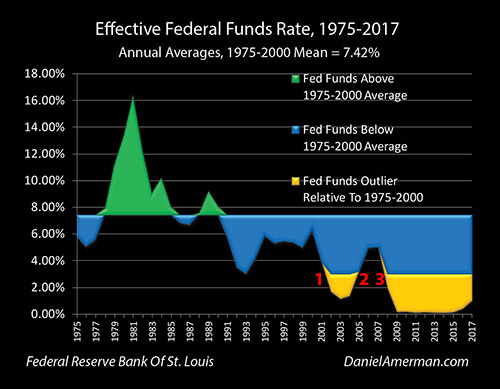
The first graph examined how the Federal Reserve has changed Fed Funds interest rates in response to changes in economic conditions. We started by looking at the historical period from 1975 to 2000, with above average Fed Funds rates shown in green, and below average rates shown in blue.
We then looked at three cycles of the containment of crisis, and exiting the containment of crisis. In the #1 cycle (red numeral "1" above) of the containment of crisis, in response to the collapse of the Tech Stock bubble and the resulting recession, the Fed swiftly forced Fed Funds rates to their lowest levels in almost 50 years. These interest rates that are entirely outside the 1975 to 2000 range are shown as golden outliers in the graph.
The #2 cycle began in 2004, with the Federal Reserve exiting the containment of crisis and swiftly increasing interest rates. The #3 cycle was the Fed rapidly decreasing Fed Funds rates to historic lows as part of the containment of the Financial Crisis of 2008 and the resulting Great Recession.
In the second through fourth graphs we analyzed the how the Fed cycles created cyclical changes in yield curve spreads, which then changed mortgage rates, that then changed what matters most to home buyers when it comes to affordability - which is not prices but inflation-adjusted mortgage payments.
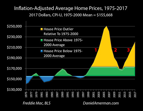
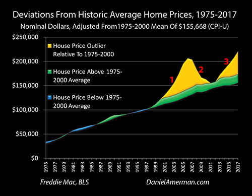
The logical result of combining the first four graphs is the fifth graph above, which is cyclical changes in inflation-adjusted home prices on a national average basis. As can be seen in the blue and green areas on the left side of the graph, single family homes used to be a very stable investment in inflation-adjusted terms, oscillating up and down in a range of about +/- 10% relative to average.
Since 2001, however, the pattern has radically changed, and home prices have been dominated by the symmetrical 1-2-3 cycle of the containment of crisis and exiting the containment of crisis, as developed in the analysis linked here. What makes understanding these cycles particularly important for homeowners and real estate investors is that the cycles have not ended, and when we use inflation-adjusted dollars to look beneath the surface, we can clearly see that a #3 cycle is currently well underway. This new cycle bears an almost uncanny resemblance to the #1 cycle, and it may also deliver magnified profits and losses in the years ahead.
The Fed's Most Powerful Influence Over Time
If we want to study and understand the underlying factors that have been dominating U.S. home prices since 2001, then there is simply no substitute for looking at both housing prices and mortgage payments on an inflation-adjusted basis.
However, that is not what most people see, or how investment prices are usually presented. Whether we are looking at money in the bank, or stock indexes, or home values - people generally simply look at just dollars, rather than the economic concept of inflation-adjusted dollars.
Something critical for homeowners and housing investors to keep in mind is that inflation is no accident, or at least at low levels it is not. One of the primary goals of the Federal Reserve is to produce a low to moderate rate of inflation each year. That means the dollar is worth at least a little less each year, in terms of what it will buy - as a matter of design. Which, rephrased, means that it should take more dollars to buy any given "basket of goods and services" - or the average house - each year than it did the year before, all else being equal.
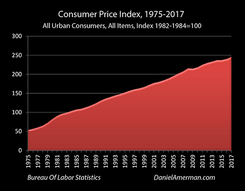
Determining how many more dollars it takes each year to buy the same things is exactly how the government measures inflation, as can be seen in the climbing red slope of the Consumer Price Index (for urban consumers) above, which is the most commonly reported measure of inflation in the United States. For example, the national average CPI-U in 2000 was 172.2, the national average CPI-U in 2001 was 177.1, this means that the annual percentage increase in the CPI-U was 2.8% - and the result of that equation is a reported 2.8% rate of inflation.
We removed inflation and used the Five Graphs to learn the logical reasons why real estate prices have been working the way they have been over the last almost 20 years. By using the CPI-U over the same time period we can put inflation back in, and see the results that matter for most people when it comes to home and investment decisions. As can be readily seen, incorporating the climbing red slope of the CPI-U transforms the appearance of the Home Prices graph, as well as the financial impact of the 1-2-3 cycles of containing crisis and exiting the containment of crisis.
The following quick implications are well worth considering.
1) The entire graph now skews upwards, with ever higher dollar prices for the average home over time - precisely because of the deliberate and core Federal Reserve strategy of making the dollar worth a little less each year.
2) On the left side of the graph, the real estate market before its state change in 2001 remains remarkably stable, but the appearance has changed. Instead of bouncing up and down over the flat line of inflation-adjusted average home prices, home prices instead move in a tight range above and below the upward sloping line of rising average price levels. The correlation between national average home prices and inflation is so tight that the green and blue areas of above and below average home prices become wispy, and almost difficult to see (aided, of course, by lower price levels creating smaller apparent dispersions).
What is shown is what used to be, which is that single family housing was a remarkably stable inflation hedge. Indeed, the historical numbers are quite clear that homes used to be a better inflation hedge in terms of actual correlation with inflation than gold or silver were, popular misconceptions that remain to this day notwithstanding.
3) Because the housing market climbed in nominal terms (not adjusted for inflation) in almost every year in the 1975 to 2000 era, this meant that average people could borrow at loan to value ratios (LTVs) of 95% and above, and on average - never have to worry about going "underwater". Yes, there were individual location fluctuations, and yes, there were individual property fluctuations, but on a national average basis, the annual destruction of the value of the dollar was almost always enough to offset any minor real (inflation-adjusted) losses.
To a degree that is difficult to overstate, that wispy blue and green line used to drive everything when it came to the financing of the American dream. Whether we look at FHA and VA loans, conventional loans, PMI insurance, securitizations, and security ratings - what they all had in common was that they were based on looking at this very forgiving situation of annual inflation being greater than any annual inflation-adjusted losses, with near absolute reliability on a national average basis.
4) Moving to the right side of the graph, the addition of the upward skew in prices created by inflation means that the #1 cycle of the containment of crisis (red numeral "1") produced substantially higher housing prices - and potentially larger profits - than we could see in the Five Graphs.
5) The addition of the upward skew in inflation means that the #2 cycle of exiting the containment of crisis produced materially lower housing losses than what was seen when looking at inflation-adjusted prices.
6) The upward skew produced by inflation means that the price spike produced by the #3 cycle of the containment of crisis is now even higher than the price spike produced in the #1 cycle, despite being materially shorter (at this point) than the #1 cycle price spike in inflation-adjusted terms.
(Some of my keen-eyed readers are likely to wonder why the implicit line of average housing prices is not smooth, but rather looks a bit odd. The answer is that any nominal display of a constant inflation-adjusted number will fluctuate with the rate of inflation, and the annual changes in average home prices therefore necessarily correspond to the uneven slope of the top line of the red consumer price index graph.)
Using Skewed Multiplication To Understand Housing Price Changes
Fully understanding how inflation works in combination with the Five Graphs to produce somewhat outsize profits - as well as reduced downside risks - for homeowners and real estate investors could initially seem a bit daunting for many people.
However, by presenting the information in percentage terms, and then using simple multiplication, the complex can become the understandable - and the understandable can become the actionable.
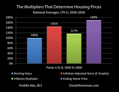
The simple four bar graph above examines the period between the years 2000 and 2006, which is the time of the enormous price spike created by the Five Graphs during the #1 cycle of the containment of crisis.
Our starting point is a national average single family housing price of $121,841 for the year 2000, which is shown in the blue bar on the left and displayed in percentage terms of 100%, rather than dollars. (The methodology involved in coming up with that single dollar number is explained in the prior analyses in this series. The annual percentage changes in home prices are based on the Freddie Mac House Price Index.)
The factors explored in the Five Graphs contributed to the price of an average home rising to $176,288 on an inflation-adjusted basis, which represents 145% of the starting price of $121,841, and is shown by the red bar.
The annual average CPI increased from 172.2 in 2000 to 201.6 in 2006, which was an increase of 17%, and is represented by the green bar of 117% in the graph.
If we begin with the blue bar of 100% starting value, and we multiply it times the red bar of 145% for inflation-adjusted price changes, and we then multiply that result by the green bar of 117% for inflation-based price changes, we get the purple bar of 169% on the right, for the ending home price. So we started with $121,841, we multiply by 169%, and we get $206,386, which was indeed the average value of a home in the year 2006. (The 169% is rounded.)
That is all there is to it. Cut through all the technical terms, just multiply the red percentage bar by the green percentage bar and we get the purple bar of the correct ending home price in percentage terms.
Through using this understandable methodology, we can clearly see the two critical ways in which inflation changes housing prices: a) it is a positive skew; and b) it is multiplicative.
Inflation creates a very forgiving positive skew to housing prices over time, with prices potentially still steadily climbing even while inflation-adjusted values may be flat or even slightly declining.
Most importantly for financial and investment purposes - this skew is multiplicative. The green bar of inflation-adjusted housing prices gains rose 45%, from 100% to 145%, between 2000 and 2006. When we multiply the full 145% times the seemingly small adjustment of the 117% inflation multiplier bar, we of get the 169% purple bar of ending home prices.
The next step is mathematically quite simple - but it is also not intuitive for many people. When we look at the margin - the increase in prices or the profits - we went from a 45% gain to a 69% gain, which is an increase of 53% (69% / 45% = 153%).
One of way of looking at this is that including even a low annual rate of inflation for a few years was enough was enough to boost investment profits by over 50% relative to what they would have been without inflation.
Another way is to say that when the actual numbers involve multiplying (100% + 45%) X (100% X 17%), then on the margin - our profits - the increase in prices is not up by 17%, but by more than 3X the 17% inflation-induced change in price levels, climbing up to 53%.
OK, some might call that sort of thing a little bit "geeky", but quite intentionally making sure that those kinds of mathematical relationships are working for you over time, instead of perhaps accidentally working against you over time, could end up making the difference between a comfortable retirement and a delayed and financially precarious retirement. That difference applies in practice, whether or not the investor in question has any idea of what is happening.
The multiplicative skew works for investments where the price itself - aside from cash payouts - is likely to rise with inflation. Common stocks and real estate (whether directly owned or through partnerships or REITs) are two major investment categories that generally benefit from the multiplicative skew created by inflation. (And yes, then there is the crucial consideration of how the multiplicative skew applies to rising dividends or rental payments, but that is beyond the scope of this particular analysis.)
The multiplicative skew is not available where the investment principal itself - not including ongoing cash payments - is contractually fixed in dollar terms. Money market funds, bonds, insurance policies and annuities are all examples of investments that generally do not benefit from the mathematics of the multiplicative skew.
An issue that is beyond the scope of this particular analysis is the specifics of how the multiplicative skew changes home equity when a mortgage is used to finance part or most of the purchase price. Because the equity investment is typically much less than the real estate purchase amount - and the liability used to finance the rest of the purchase is fixed in dollar terms - then there is a doubling of the multiplication, where 1) the inflation-adjusted housing gains become a multiple relative to the equity investment; and 2) the inflation-based housing gains become a multiple relative to the equity investment. This 1-2 combination can lead total gains that can be extraordinary over time, even in an environment of relatively low inflation.
This effective doubling up of the multiplication skew can be available with home ownership, direct property investments, partnerships, or with REITs that have a debt component.
The Skewed Multiplication Of Housing Prices In A Time Of Losses
The above analysis looked pretty good for housing investors, and it should, as the 2000 to 2006 period was what would later be labeled a housing bubble. The bubble was of course followed by the collapse of the bubble and major losses for millions of homeowners and real estate investors. So, how does the multiplicative skew of inflation impact a time of crippling housing losses?
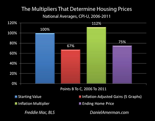
As can be seen above, if we go from the peak of 2006 to the trough of 2011 (2012 was about the same as 2011 in inflation-adjusted terms), then the average single family home lost about a third of its value in the space of five years.
As explored in detail in the Five Graphs of the previous analyses, this massive loss was both historically unprecedented - and was the logical flip side of the cycle. Even by 2004, changes in Fed Funds interest rates, yield curve spreads, mortgage rates and inflation-adjusted mortgage payments were beginning to occur as part of the #2 cycle of exiting the containment of crisis. The combination of these factors would lead to falling housing prices by 2007, and would play a key role in creating the Financial Crisis of 2008 and the Great Recession.
As can be seen in the red bar above, the inflation-adjusted price of the average single family home fell to 67%. However, even during this time of low government-reported inflation, the Consumer Price Index still increased by 12%, to a total of 112% (relative to a starting value of 100% in 2006).
Multiplying the blue bar of starting value (100%) times the red bar of inflation-adjusted housing prices (67%), times the green bar of general price level changes (112%), leads to the purple bar of ending home prices (75%).
In dollar terms, national average home prices fell from $206,386 to $155,138, which was a loss of $51,248. When compared to the starting investment of $206,386, that is indeed a decline of 25%.
So, even during a time of steep price losses and low inflation, inflation still created a positive skew to the upside that was multiplicative. In simple terms, relative to the starting amount of 100%, this was an 8% reduction in the amount of losses.
The losses in the 2006 to 2011 era were entirely outside the prior historical range, for the reasons developed with the Five Graphs and the previous analyses. The damage was particularly bad for those who had borrowed at 90%+ LTVs - but it could have been much worse.
All across the United States, if it had not been for the multiplicative positive skew of inflation, then homeowners would have on average lost about an additional $16,500 in home equity (8% of $206,386) - on top of the $51,248 which they did lose (on average). Many millions of additional households would have gone "underwater" across the nation, and for those who were underwater, the degree to which they were underwater would have been worse. This would have not only increased the financial pain for the individuals, but would have magnified the damage to the economy and the nation as a whole.
If we look at what happened on the margin - the percentage impact on the profit or loss itself - then the impact of even a low reported level of inflation was again disproportionate. Without inflation, there was a 33% loss. Multiplying the 67% inflation-adjusted price times 112% moved nominal prices to 75%, reducing the loss to 25%. So a 12% increase in price levels was sufficient to reduce the degree of housing losses by the outsize amount of about 24% ([33% - 25%] / 33% = 24%). This 24% reduction in losses on the margin was about 3X as large as the simple 8% reduction when compared to the initial total investment.
This reduction in losses was also very important for those using mortgages from an investment perspective, either directly or through partnerships or REITs. The general rule is that simple leverage multiplies both profits and losses.
However, when it comes to targeted asset/liability management strategies which deliberately create an inflation differential where the asset side of the strategy is benefiting from the multiplicative positive skew of inflation but the liability is fixed in dollar terms, then there is a double improvement, with not only much higher upside potential, but also a decrease in the otherwise higher degree of losses associated with using a mortgage in a downside scenario. The losses were still there with that combination of both buying and selling at the worst possible times, but were not nearly as bad as they could have been.
A Multiplicative Skew Over Two Cycles
As we explored, the impact of the multiplicative skew of inflation was to create exaggerated profits during the price spike upwards associated with the #1 cycle of the containment of crisis, and to mitigate the losses with the price spike downwards that was the result of the #2 cycle of exiting the containment of crisis.
If we look at price movements on an inflation-adjusted basis, then as seen above and as developed with the Five Graphs, the #1 & #2 cycles in combination produce a very symmetrical pattern, with the trip down almost completely wiping out the trip up, and leaving us close to where we started. So the whole housing investment might seem a "wash", exclusive of interim cash receipts and the impact on taxes.
However, relatively few people see the world in those terms, and the great majority of investment reporting is not done on that basis. Instead, people look at dollars, returns, and changes in indexes. To see the up and down cycles in those terms, we need to return to our four bar graph.
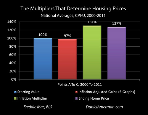
The four bars above combine our previous graphs, starting at price levels and national average housing prices in the year 2000 - before the real estate bubble kicked into gear - and ending in the year 2011, in the depths of the trough following the collapse of the bubble.
Our starting point is again a housing value of 100%, and we multiply that blue bar times the red bar of inflation-adjusted gains. Because national average housing prices in inflation-adjusted terms were just a little lower in 2011 than in 2000, we multiply times 97%, for a slight loss.
However, because of inflation, general price levels rose by 31% over those same years. So when we multiply the red bar times the green bar, 97% X 131%, we get the purple bar of 127% ending house prices. Moving to dollar terms, national average home prices went from $121,841 in 2000 to $155,138 in 2011, which was a very solid 27% increase of $33,297.
Now, for those who have been following each of the analyses in this series, to refer to that $33,297 national average increase in housing prices as being a "very solid 27% increase", might seem like to be a form of cheating and even downright deceptive. There is no 27% gain, not when we take the analytically rigorous approach of evaluating everything in inflation-adjusted terms, but rather there is a 3% loss that is being entirely masked by illusion of monetary gains that are really just inflation.
But yet, in the terms of how almost all of the world looks at investments, and how investment price movements are almost always reported, that 27% gain is entirely, unquestionably, one hundred percent genuine. Whether we look at stock indexes, home prices, bond prices, precious metals prices or banking or brokerage or retirement account statements in general - they are almost always presented in terms of a dollar being a dollar.
When we begin with the combination of the largest inflation-adjusted real estate profits and losses in our lifetimes, and we multiply that rigorous and rational base by the powerful positive skew that is inflation, we get a mathematical transformation that strongly increases the upside potential even while mitigating or even wiping out the downside risks - given enough time.
And again - that multiplicative skew applies every bit as much to common stocks as it does to real estate. Looking over the historical record, many (though not all) years of what have been reported as record setting gains for stock market indexes have been nothing more than flat markets or real losses that have been multiplied upwards by the increases in general price levels.
Returning to real estate, the resulting gain is not only entirely real in terms of profits and retirement account statements (if invested in REITs), but it can itself be multiplied for the purposes of determining net worth if the housing was at least partially acquired with debt, whether in the form of a home mortgage, or borrowing by the partnership or the REIT.
The relationship between the multiplicative skew of inflation and asset/liability management (ALM) can be one of the most powerful forces in finance, even if it is little understood or utilized by most individual investors. For the years 2000 to 2011 and a homeowner or investor who experienced nationally average results for housing purchased primarily with debt, there was no catastrophe or even a wash - but a lucratively profitable investment over the full course of the double cycle, even if the homeowner or investor had sold in the very worst year of the double cycle to sell (popular misconceptions notwithstanding).
(For keen-eyed readers, it should be noted that the 2011-2012 housing prices are shown as being above average in the previous Five Graphs analyses, and as slightly below average in this analysis. The difference is the starting base, which is the 1975-2000 inflation-adjusted mean for the previous analyses, and is the average for the year 2000 in this analysis.)
The Multiplicative Skew & The Second Spike
One of the core features of the previous analyses was the identification & analysis of the second price spike.
As seen in the Home Prices graph (which is repeated above for ease of scrolling), when we look in inflation-adjusted terms, then a second spike can be seen in the years of 2012 to 2017, which bears a remarkable resemblance to the early years of the first spike, the #1 cycle of the containment of crisis.
Now, why there would be not only a second spike but one that bears an almost uncanny resemblance to the first spike is quite problematic for those who assert that the steep real estate price increases of 2001 to 2006 - and their subsequent collapse - were each "one off" aberrations that can be safely ignored when looking at current real estate ownership and investment.
On the other hand, when we walk through the Five Graphs step by step (analysis link here), from Fed Funds rates to Yield Curve spreads to Mortgage Rates to inflation-adjusted Mortgage Payments to inflation-adjusted Home Prices, then we can see a remarkable similarity between the #1 and #3 cycles of the containment of crisis, and how the same factors in the same sequence are driving quite similar changes in inflation-adjusted Home Prices.
This remarkable similarity persists when we analyze how the multiplicative skew of inflation modifies the inflation-adjusted price spike to produce the ending actual home prices in normal dollar terms.
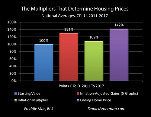
We begin with the blue bar of the starting value of homes in 2011 of 100%, we multiply times the red bar of the 131% in inflation-adjusted housing gains, we multiply that product times the green bar of an increase in general price levels to 109%, and we get the purple bar of ending home prices in 2017 of 142%.
Expressed in dollar terms, the national average price of a home in the United States climbed from $155,138 in 2011 up to $220,958 in 2017, which was an increase of $65,820 (42%).
As with cycle #1, the underlying fundamental factors captured in the Five Graphs produced a historically abnormal extreme price movement in a relatively short period of time, that was about 3X the outer boundary of the range of inflation-adjusted price changes in the housing market prior to 2001.
As with cycle #1, even a quite low government reported rate inflation was sufficient to produce a positive skew that when literally multiplied by the inflation-adjusted gains was able to produce a much larger gain of over 40%.
When we look on the margin, the result of the multiplication of that low 9% increase in price levels was nonetheless sufficient to increase the size of the profits by about 35% (42% / 31% = 135%). So the end result of the multiplication was an increase in profits was almost 4X what the amount of the inflation was.
Each time that we see a price spike in inflation-adjusted prices, and we then take into account the general increases in price levels during that time, we get a multiplicative increase in the height of the spike, and an even greater increase in the percentage profits on the margin. This pattern was dominant during the #1 cycle of the first spike, and we are seeing something remarkably similar (to date) with the #3 cycle of the second spike.
Remarkably Bad Timing & The Multiplicative Skew
The previous analysis section assumed a purchase at the base of the trough, which is the optimal time for buying an investment. How do the numbers look with a purchase at the worst possible time, which is the top of the previous peak?
In inflation-adjusted terms, the second spike in housing prices produced by the #3 cycle of the containment of crisis is (to date) not nearly as high as the 2006 top of the spike in the #1 cycle. Based on inflation-adjusted national average home prices for 2017, there is still about a 12% loss relative to 2006, as can be seen in the red bar below.
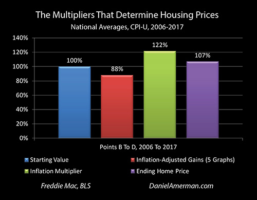
To factor in the impact of the multiplicative skew of inflation, we begin with the blue bar of a 100% starting value, we multiply times the 88% red bar of inflation-adjusted price changes, we multiply that product times the green bar of new general price levels of 122%, and we get the purple bar of ending home prices that are 107% of where they started.
In dollar terms, national average home prices climbed from $206,386 in 2006 to $220,958 in 2017, which was an increase of $14,572 (7%).
Of the 18 years (inclusive) covered in this analysis, the year 2006 would have been the worst single year to buy a single family home. Relative to 2017, this is a true worst-case scenario - for the national averages. And indeed, there is a significant loss in inflation-adjusted terms for these worst-case assumptions.
However, when we move from the rigorous and analytically superior approach of comparing the purchasing value of investment assets at different points in time, to the simple comparison of dollars - there is no longer a loss at all, but a gain. Even assuming the worst possible year for a purchase, the very peak of the previous price spike, then based on national averages, the average homeowner or investor is now materially ahead.
Even more so than with the 2006 to 2011 period, the multiplicative skew of inflation has changed every aspect of what most homeowners have experienced in recent years as well as likely the economy as well. The numbers are quite clear - a 12% national average loss means that the average home would still be about $25,000 underwater relative to its peak valuation in 2006.
On average, every person selling or thinking about buying their home, would be taking about a $25,000 hit to their equity. This is particularly problematic for those who bought at the peak, but it would apply to everyone. On an average basis across the nation, local real estate markets would have not yet recovered from the housing crash, and the price would be paid every time a home was sold (or not sold because of the loss).
Yes, we are in the midst of a second price spike. But on an inflation-adjusted basis, this spike is not yet nearly as tall yet as the first spike. So the foundations for the current perceptions about a surging home market and record valuations are in most locations not so much based on increases in home values, but decreases in the purchasing power of the dollar - the almost universal beliefs to the contrary notwithstanding.
Now, when we look at housing price changes in dollar terms - along with the related investment price changes for partnerships and REITs - and we compare to how results are generally reported for alternative investment categories such as stocks and bonds, then there is no question that the outcome of the worst case test of buying at the worst possible time is nonetheless a gain, and that that gain is entirely real.
With the source of that gain not being the factor of housing values - but the multiplication of the other factor of the positive skew of inflation. Even if we accept at face value the government's assertion of extremely low rates of inflation since 2006, there has still been a sufficient destruction of the purchasing power of the dollar so that it takes 122 cents to buy what 100 cents used to buy.
This steady positive skew overwhelmed the actual reduction in underlying investment values, in this particular worst case scenario for the modern housing market. We are indeed in a record-setting real estate market, with rapidly increasing homeowner equity and investor profits across the country.
This is not to say that we can now ignore the changes in inflation-adjusted values - because our dollar outcomes are always the product of the multiplication of two factors. And as with any other multiplication problem, if we focus solely on one factor to the exclusion of the other - there is a very good chance we are making a mistake, and perhaps a major mistake.
Where things get really interesting then is when we take it to the next level, and look at the potential opportunities from an asset/liability management perspective. For someone in the example period who bought housing using a liability of some form, whether a home mortgage, investor mortgage, or some sort of partnership or REIT with a debt component, then even in this "worst case scenario", national average results would have produced something likely much better than the 7% asset increase. And the financial mathematics of playing off financing an asset with a multiplicative skew against a liability with no such skew are both fascinating and potentially lucrative, particularly if deployed as an inflation hedge within a larger portfolio.
The Multiplicative Skew Over The Longer Term
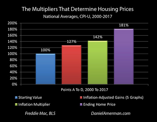
When we look at the full period from 2000 to 2017, then we get the most powerful multiplication equation of all. Beginning with the blue bar of a starting value of 100%, we multiply times the red bar of inflation-adjusted prices of 127%, and then multiply that product by the green bar of ending price levels of 142%, which produces the purple bar of ending house prices of 181%.
In dollar terms, national average home prices went from $121,841 in 2000 to $220,958 in 2017, which was an increase of $99,117 (81%).
The end result (to date) of this extraordinary period of housing turmoil was an increase in net worth of almost $100,000 for the average person just for the simple act of owning a home and experiencing national average results. And for someone who had bought a national average home in 2000 with an 80% LTV mortgage - then their $24,368 initial equity contribution would have grown to $123,485 in home equity by 2017 (not including mortgage amortization), which is an increase of almost 5X in less than 20 years.
One factor is the red bar of inflation-adjusted housing prices. The end result (to date) of the Five Graphs and the #1, #2, and #3 cycles of the containment of crisis and exiting the containment of crisis is an increase of 27%, and an ending purchasing power value that is equal to 127% of where it started.
The other factor is the green bar of the multiplicative skew of inflation, and both of those components - skew and multiplication - are critical when it comes to understanding ending housing prices. This is the longest of the time periods we have looked at with the four bar graphs, and because inflation creates a positive skew of higher price levels each year, the farther out in time we go, then the greater the cumulative impact of the skew, and the higher the price level that is produced. And because that price level is multiplicative, the farther out in time we go, the greater the degree to the skew changes our nominal dollars results relative to the inflation-adjusted results.
When we look at these historical results on the margin, then the multiplicative impact of price levels rising by 42% is to boost the level of our profit not by less than half - but by 3 times (81% / 27% = 3). And again, while most people don't look at the world in this way, that is exactly the kind of math that investors should want to be working for them, rather than working against them.
A different way of looking at historical results is to say that a mere 27% increase in inflation-adjusted prices over 17 years does not sound very impressive - an investor might be tempted to say "big deal", given the small size of the increment.
However, when we look at historical results on the margin, we did not boost our after-inflation profits by roughly a quarter, but by almost double (81% / 42% = 193%) relative to an investment that exactly kept pace with inflation (and many investments don't do that).
When we look at money and returns the way that the world almost always does - which is simply in dollar terms - then what we have been studying in this historical analysis of the modern housing market is a number of examples of what is quite literally the multiplication of wealth.
A Series Of Multiplications Over Time
The graph below tracks the history of the multiplication of the factors that determined housing prices over the years from 2000 to 2017. While it is a line graph, the colors correspond to the bar colors from the four bars series of graphs which covered individual time periods within that range.
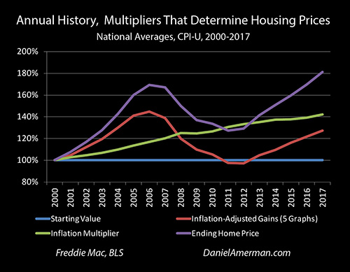
For each year, we start with the flat blue line of the average value of a home in the United States in the year 2000, we multiply times the red line of inflation-adjusted housing prices, we multiply again by the green line of the general price level as measured by the Consumer Price Index, and we get the purple line of national average housing prices in dollar terms for that year. In each and every year, the purple line is the product of the red line multiplied by the green line.
Let's begin by considering the red line. While not seen in this graph but as covered in previous analyses, inflation-adjusted real estate prices were quite boring in comparison prior to 2001, just cycling up and down around the average, but never breaking out of about the +/-10% range.
However, since the Fed responded to the collapse of the tech stock bubble and the resulting recession by smashing short term interest rates down to their lowest levels in almost 50 years - and thereby setting the Five Graphs in motion - inflation-adjusted housing prices have followed a much more dramatic path. In response to the three cycles of #1, #2 and #3, housing values have spiked to a peak, crashed to a trough, and are currently spiking upwards again.
The green line of price level changes is not nearly as exciting as the red line, but it is much more consistent. It just keeps trudging up to the right, steadily climbing through the cycles, while skipping the peaks and the trough. As it goes to the right, the relative importance of the green line compared to the red line for multiplication purposes - i.e. the relative distances of the green and red lines from the blue line of the base - grows steadily larger.
The purple line of housing prices measured in nominal dollar terms - which could also be called the wealth line - is much more dramatic than either the red or green lines. The purple peaks are dramatically higher than either of the red peaks, and there is an amplification of the price movements as the purple line moves much further away from the base than the red or green lines.
What we see with the purple line of housing prices is the year by year development of the cyclical price changes, the skew and the multiplication.
As we go through time, the entire purple line of housing prices - and wealth changes - tilts ever more upwards because of the positive skew of inflation. The underlying pattern of the red line is symmetrical, but the pattern of the purple line is asymmetrical.
As we go through time, the magnitude of the price changes in the purple line - the way the world measures wealth - becomes ever greater relative to the lesser swings in the red line of inflation-adjusted price changes, because of the multiplicative power of the green line.
Now, just to be clear, what is being shown above is not the relationship between inflation and individual years, but the rather the relationship between inflation and holding period, meaning the time that an investment is held. Inflation was not a more powerful influence in 2017 than 2001, and indeed the annual rate of inflation was higher in 2001 than it was in 2017, meaning that the single year impact was greater in 2001.
What is shown is that the longer the time that a strategy is maintained, the more dominant the influence of the multiplicative skew of inflation becomes, and the greater the nominal dollar difference between the red line of inflation-adjusted cyclical price changes and the purple line of annual average housing prices. It isn't that inflation-adjusted price changes go away - the math remains a straight up exercise in multiplication and the red line is always critical - but the expression of those underlying changes becomes increasingly dissimilar as the result of the growing cumulative power of the positive skew.
The numbers above are the historical record and they applied to homeowners, investors in single family residences, and partnership or REIT investors who were invested in pools of single family residences or real estate that followed similar price patterns. On a national average basis - this is exactly what happened, and hopefully the reader now has a much better idea of what happened, why it happened, and what some implications could be for the future.
It also needs to emphasized that what governs asset/liability management results is the purple line of housing prices - not the red line of inflation-adjusted price changes. So for those who financed some or most of their investment with home mortgages, investor mortgages, or who invested in partnerships or REITs with a debt component - they would have had a magnified participation in the skewed amplification that is the purple line of average home prices.
The Cycles & The Skewed Multiplication Of The Five Graphs
This the third of a series of core analyses, all of which can be found on the series page linked here, along with some additional key supporting analyses.
In the first analysis we took an intensive look at why real estate prices over the last almost 20 years have completely changed their behavior relative to the historical record. We developed the Five Graphs as a way of rationally explaining the fundamental factors that drove home price changes during Cycle #1, the initial containment of crisis.
In the second analysis, we examined the 1-2-3 series of the first housing price spike, the collapse of that spike, and the growth of the second price spike. We used the Five Graphs to explore why that historically unprecedented series of radical price swings was the logical result of the #1 cycle of the containment of crisis, the #2 cycle of exiting the containment of crisis, and the #3 cycle of the containment of crisis.
We then raised some crucial questions: based on recent changes in the Five Graphs. Are we now in the midst of a #4 cycle of exiting the containment of crisis? Could this be followed by another recession, another possible financial crisis, and another round of radical decreases in inflation-adjusted housing prices in the coming years?
And perhaps most critically of all - if we do get the #4 cycle and another round of sharp price decreases, will that new trough be followed by the emergence of a third price spike upwards, as part of the #5 cycle of the containment of crisis?
In this third core analysis, we took the patterns and understanding that had been developed using inflation-adjusted prices, and performed the translation into how the world generally views wealth and investment returns, which is that of simple (nominal) dollars.
The powerful multiplicative skew that was introduced is critical for understanding the past and the present.
This understanding is also crucial when it comes to evaluating potential future risks and opportunities.
If there is indeed another housing price crash as the result of a #4 cycle of exiting the containment of crisis - then we use the red line of inflation-adjusted dollars to see the cycles and the patterns, and then the purple line to get an idea of potential price changes, or to estimate some possible dates and ranges. To make better decisions we need both the red line and the purple line.
Another key perspective that has been developed in this series is that if there is a #4 - it is not necessarily the "end of the world" or the end of the cycles. If there is a #4, then will there be a #5? And to track both phases of the cycles together, #4 and #5 in sequence in the attempt to identify opportunities while reducing risks, we definitively need to see the red, green and purple lines together.
It is likely fair to say that relatively few homeowners or real estate investors are viewing the world in the terms that have been developed in this series of ambitious analyses. It is my hope that the reader has found a series of useful new perspectives in these analyses, and that these perspectives will be of value to you.
The Multiplicative Skew & Other Resources
The topics covered in this particular analysis can be viewed as the intersection of two different kinds of resources.
In terms of the Red/Black matrix developed in other analyses in this series, this current analysis can again be placed in the "B", "D" and "C" columns.
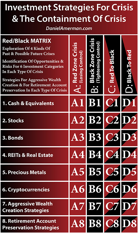
(Red/Black matrix pdf link here.)
The columns are the cycles themselves, and cycle phase #1 is the Black column "B", the containment of crisis.
The cycle phases transitioning from #1 to #2 (and the accompanying major price swings) is the Black to Red column "D", the cyclical movement from the containment of crisis to crisis.
The cycle phases transitioning from #2 to #3 (and the accompanying major price swings) is the Red to Black column "C", the cyclical movement from crisis to the containment of crisis.
Because the focus of this analysis is real estate, which is the 4th row, the applicable matrix cells are B4, D4 and C4.
This particular analysis is an equally good fit with the introductory asset/liability management materials found in the online course (link here), and the much more detailed analyses found in the DVD course (link here).
In this analysis, we discussed simple equity price changes. In practice, the multiplicative skew applies to rental income payments as well. The DVD course is a greatly expanded asset/liability management analysis that examines a variety of investment strategies and goals, and includes pre-inflation and after-inflation rates of return with various scenarios relative to asset prices, LTV ratios, interest rates, mortgage payments, and differing rates of inflation for asset prices, rental income, and property expenses, as well as differing vacancy rates. (The Red/Black investment strategies scenarios do not however directly feed into the asset/liability management scenarios.)
*******************************
Read the Red/Black investment strategies DVD course brochure.