Out Of Money By November 29th - Social Security Indexing Part 3
By Daniel R. Amerman, CFA
TweetIn this analysis we will combine two "technicalities" that many people have probably never even thought about, and show how in combination and over the course of a retirement - they can completely change our day to day quality of life.
We will examine how these factors can in combination cost the average retiree a full month of income on a purchasing power basis within 10 years. For someone who depends on Social Security for all or a major part of their income, this means that they would have 12 full months of expenses - but the money to pay the expenses would run out by November 29th.
If we take these same two technicalities out for 20 years - then more than seven weeks of income purchasing power will be lost. Which means that the money runs out by November 9th.
When we fully understand the long-term impact of these seeming subtleties, then we get something new and important: an additional screen for retirement decisions that can change the decisions we make today. And in the process, help determine whether we ultimately have enough money to make it through the end of the year - or we run out in November.
This analysis is part of a series of related analyses, an overview of the rest of the series is linked here.
Quick Summary Of Analysis Parts 1 & 2
As established in the first two analyses of this series, Social Security is not fully inflation indexed as a matter of design.
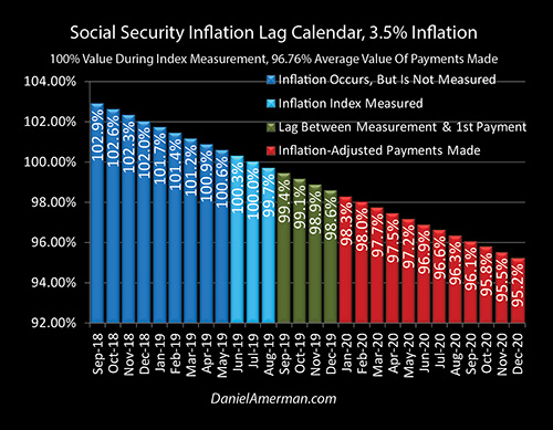
There are instead two distinct forms of inflation lags as explored in the Part 1 analysis which is linked here. We have the lag between when inflation is measured (the light blue bars) and when the first payment based upon that measurement is actually made (the red bars).
And then on top of that we have a steadily decreasing purchasing power for each benefit over the course of the year which with historically average inflation means that the December benefits are likely to have a purchasing power of only 95 cents on the dollar.

As established in that first analysis, at higher rates of inflation just these two seemingly trivial factors of the initial inflation lag and then the impact of lower benefit values over the year are enough by themselves to reduce the purchasing power of our benefits by a full one month per year.
And at many of the annual inflation rates that we've experienced over the last 30 or 40 years, inflation lags by themselves are enough to cost us two or three weeks of standard of living per year in terms of purchasing power, at least when compared to what genuine fully inflation indexed payments would look like.
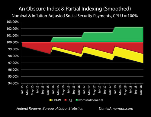
In Part 2 of this series of analyses as linked here, we moved from long-term averages to what has been happening in recent years.
We've had a much lower government reported inflation rate and we've had much lower benefit increases. Crucially, we've also had a mismatch between the benefit increases as determined by the government using its detailed methodology with the CPI-W index, and what the government reports to be average inflation for the nation with the CPI-U index.
Again these may sound very minor but even in a relatively short period of time we can see how the yellow area of purchasing power lost to this index mismatch steadily decreases standard of living for the nation as a whole in terms of retirees who are relying upon Social Security, or other retirees such as federal government employees who are receiving their own inflation indexed plans.
Very Small Changes
The difference between the CPI-U and CPI-W inflation-based indexing methodology used by the government in recent years is a subtlety – but it is not the only subtlety. As we will be exploring herein, the fundamental question that will determine standard of living for many millions of retirees is whether their benefits will grow at exactly the same rate as their expenses in retirement – or whether they won't.
There are many potential sources for a mismatch like what we're seeing here – or a much larger mismatch.
It could be the geographic location that you live in – expenses grow at different rates in different parts of the country.
This also ties very directly into the critical rent versus own in retirement decision when it comes to housing. Renters generally have a higher exposure to rising shelter costs than do homeowners.
One of the factors to be taken into account is that taxes - particularly on a state and local basis - tend to grow over time. These are not included in the inflation indexes. So just state and local taxes by themselves are enough to impact long-term financial outcomes in retirement (an issue which affects both homeowners and renters).
There's also the critical and underappreciated factor that the obscure CPI-W inflation index which Social Security benefit indexing is based upon is not only not based on retiree expenses - but quite ironically, it is designed to exclude retiree expenses.
The widely reported Consumer Price Index for All Urban Consumers (CPI-U) includes retirees, but they are a minority compared to those still working. The little reported Consumer Price Index for Urban Wage Earners and Clerical Workers (CPI-W) measures price levels only for the average expenses of urban workers. Which by definition means they are not retired. Which leaves us a sharper difference between the different expenses of younger current workers, and those of older retirees, than we would have with the CPI-U.
Retirees typically have a different composition for their spending than do younger people. For those older people on fixed incomes, shelter, food and medical care may consume a larger part of their spending. There have been higher inflation rates in each of those categories in recent years than we have seen with either the overall CPI-U or CPI-W, and many retirees are already finding that their benefits are not keeping up with their personal rate of expense inflation.
Again - this difference between retirees and current workers is exacerbated by Social Security benefit indexing being based on the worker-only CPI-W, rather than the broader CPI-U. Which would tend to imply that we're going to have significantly higher expense growth over time for most retirees than what the benefit increases will be keeping up with.
And as we will see, all it takes is a very small differential over enough time between the rate at which benefits are growing and the rate at which expenses are growing, and there is a surprisingly powerful financial impact on retirees.
Three Small Changes
Relative to the second analysis we're going to make three small changes in this third analysis. First, we're going to look strictly to the future and not use that blend of going back to 2015.
Instead of using government reported inflation in recent years we'll be looking at the longer term historically average inflation rate of about three and half percent.
Instead of calling it a CPI-U versus CPI-W differential, we're just going to say that there is a 0.60% index mismatch between benefits and expenses that could come from any one of a number sources or from multiple sources in combination.
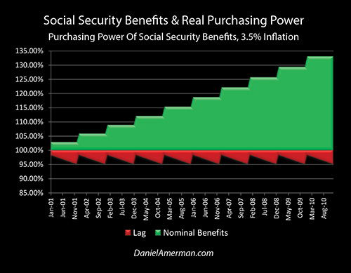
When we start with the basics and we look at benefits versus purchasing power using the same graphic methodology developed in previous analyses, we can see that with historically average inflation there is indeed a stair step pattern over time as benefits increase. However, on a reality basis, if we return to historically average inflation then we have a substantially larger "saw-tooth" pattern of the red area of lost purchasing power, with recurring inflation losses being significantly larger than they would be with lower inflation rates.
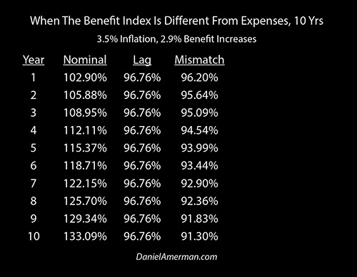
The relationship between nominal (meaning not adjusted for inflation) benefits, inflation lags and a slight benefit/expense mismatch may seem obscure, but as can be seen in the table above, small and obscure things can do surprising things over time - which can fundamentally impact retirement decisions and standard of living in retirement.
Our assumption is that benefits increase by 2.9% per year (which is significantly higher than the increases in recent years), but that inflation is 3.5% per year. Now this 3.5% rate of inflation could be the CPI-U, or it could the "real" rate of inflation, or it could be the average annual rate of increase in retiree expenses for the nation as a whole.
Or, perhaps the most relevant way of looking at this is to say "forget the national statistics", and look at what may be happening with your personal expenses and the rate at which they are increasing for you in practice, as that is what determines your personal standard of living.
As can be seen in the first column, our first year nominal benefits are 102.9%. (This is from a starting point of 100% in the middle of the Social Security index measurement period in the previous summer, per the Part 1 analysis). The second year benefits are 102.9% of the first year benefits, or 105.88%, and these grow each year at that 2.9% rate until they reach 133% by year ten.
The "Lag" column is the second column and it isolates the financial impact of just the two recurring inflation lag losses of the six month gap between measurement and the first payment, and then the further decreasing purchasing power of each benefit payment over the rest of the year.
So just from inflation lags alone and using historically average inflation, in the first year the purchasing power of benefits is only 96.76%. Even in that first year then, there is a gap of over 6% between appearance and real purchasing power. However, as we continue down the column and is covered in more detail in Part 1 - so long as inflation is level at 3.5% then the loss just resets and repeats each year but never grows.
Oh, the gap between the surface and reality steadily grows. The gap between the surface of nominal dollar benefits and the actual purchasing power of those benefits exceeds 10% by year three, 20% by year six, and 30% by year nine. But the real inflation lag losses themselves never increase.
However, the third column of "Mismatch" is cumulative - and that can change everything over the course of a long current or future retirement.
If every year our benefits increase by an average of 2.9% and our personal expenses grow by 3.5%, then we get a little gap in year one that is just trivial. Our purchasing power gets pulled down by just 0.56%, or less than 1/10 of the far bolder gap between the nominal and inflation lags.
In year two we get another trivial decrease, and we lose another 0.56% in the purchasing power of our benefits. This is cumulative - but the total is still only 1.12%, and out of all the possible financial worries for someone in retirement, it is hard to get worked up over a little more than a 1% differential.
But by year four we hit a round number - between inflation lags and that trivial mismatch, the value of our benefits falls to less than 95 cents on the dollar. We are down to less than 94 cents on the dollar by year five, and less than 93 cents by year seven.
And by the time we are 10 years out we are down to just a little over 92 cents on the dollar in terms of purchasing power – even though it looks like on the surface we're up to 133 percent.
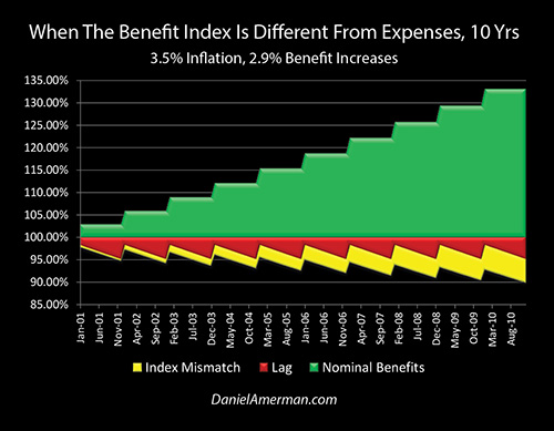
The extraordinary power of small cumulative shortfalls becomes visually obvious when we look at it graphically. The yellow area in the graph above represents purchasing power losses – meaning expenses we can no longer pay for – that steadily grow over time.
As reviewed in the numerical chart, the yellow area is just tiny little slivers in the first and second years. It catches up to inflation lag losses in the middle years. The yellow area of even this slight mismatch between indexing and expenses becomes visually dominant by the last several years.
The patterns shown above appear unusual - but every current and future retiree for whom Social Security will be an important component of their retirement income needs to understand these patterns and understand them well.
There is the green stair step pattern of steadily rising benefits (in theory), as a result of inflation indexing. There is the red saw-tooth pattern of both forms of inflation lag losses. There is steady growth of the purchasing power losses from the slight mismatch between income and expense growth rates in the yellow area.
And because purchasing power losses are the sum of the lag losses and index mismatch losses, a zigzag pattern to the downside is created where each January starts a little worse than it did the year before, and by each December (on average) a new low is reached compared to all previous years.
The Major Impact Of Small Technicalities Over 10 Years
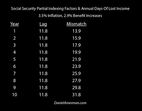
When we look at this in terms of a 365 day year as developed in previous analyses, and we look at the tangible cost of those percentage changes, then we can see that in year one with historically average inflation we're losing about 12 days of purchasing power to inflation lag losses.
When we include the initial subtle impact of having that 0.60% index mismatch between income and expenses, we are effectively at two weeks of losses ((365 days X (1.0 - 0.962)) = 13.9 days).
By year two we're up to 15 days or over two weeks of purchasing power losses.
By year six we've lost a full three weeks of purchasing power to these seemingly subtle factors.
By the time we reach year 8 we've effectively lost four weeks of purchasing power.
In ten years we are 32 days short in terms of purchasing power just from the seemingly trivial factors of the double inflation lags, and a 0.60% annual mismatch.
A One Month Reduction In Income In Ten Years
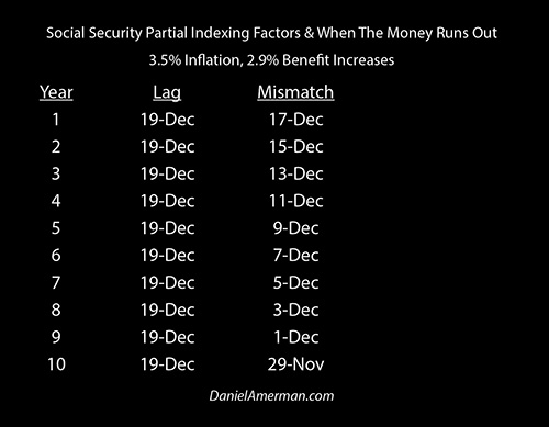
When we put this on our calendar basis, that means that we are running out of money by the middle of December in the second year.
By year six we've only got one week of income available to cover a full month of expenses in December.
By 10 years out we're running out of money in November each year - and there is no money to pay for December.
This is a stunning result - specifically because no bold numbers are being used. We're just looking at the historically average rate of inflation between 1933 and 2017. Our annual difference between benefit increases and expense increases is a mere 0.60%.
Now, as covered in the Part 2 analysis, our recent experience has been a 0.47% differential between the what is normally reported as inflation, the CPI-U index, and the actual 0.75% average annual increases determined using the CPI-W index and the Social Security Administration methodology.
So all we are looking at - is a 0.13% increase over what we have officially seen over the last several years, or about 1/8 of 1%. Even if the recent 0.47% mismatch does not persist into the future, there are still myriad different sources that could create a quite minor mismatch in national - or personal - retirement expenses versus the Social Security index.
But yet, even with these truly minor and obscure factors - partial inflation indexing has a mathematical power that is far greater than most people have any idea.
Working through the numbers with these very minor and reasonable factors is still enough to create a situation for the retirees of an entire nation who are dependent on Social Security, where in ten years they have (relative to today) 12 months of expenses to pay, but only 11 months of income to pay them with.
This could be viewed as a one month reduction in income for someone who is currently retired and collecting Social Security.
It could also viewed as one month less in Social Security income being available compared to today, as the starting point for someone who retires in ten years. Both viewpoints are valid, and both have potentially revolutionary implications when it comes to the retirement financial planning process.
It is also important to keep in mind that this is no "stress test", or gloom and doom pessimistic scenario. We are (for now) assuming that government inflation statistics are completely reliable. We are (for now) assuming that Social Security benefits are paid in full into the indefinite future, with no changes in the rules. We are not taking Medicare Part B premiums into account (yet).
This is a good place for the reader to stop and do a personal reality check about whether what is shown herein is valid or not. As covered in Part 2, and what is quite openly a matter of public record, the average annual increases in Social Security benefits over the last 3 years have been 0.75% per year.
Do you believe that your personal expenses have increased by 1.35% or more per year over those three years? Do you expect that situation of a 0.60% or more differential to persist?
If your answer is "yes" to both questions, then you should expect at least what is being shown herein. And if you think that your personal expenses have been increasing by significantly more than 1.35% per year - then the bottom line over time may be substantially worse than what is shown herein.
The Extraordinary Impact Of Small Technicalities Over 20 Years
Of course, many people who are making early-stage retirement decisions are looking at much longer time frames than 10 years.
If we look at someone who is retiring in their early to mid sixties and they have an average life span, then they're easily looking at 20 years and potentially much longer where they need to be covering expenses.
This becomes even more important for someone who is considering retiring in 5, 10 or 15 years from now, as they could be looking at time frames of 30 years or more for these factors to continue to build.
So we need to take a look beyond 10 years, as these factors do become much more powerful when we go out in time.
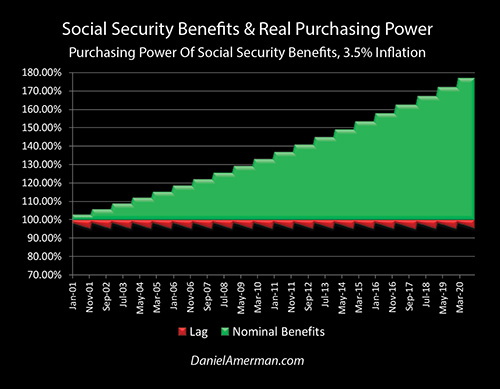
Over 20 years, our inflation lag basics are still the same, just larger.
We would build to the point with 2.9% annual increases where nominal benefits have almost doubled – but we're still never actually whole when it comes to purchasing power. That never changes.
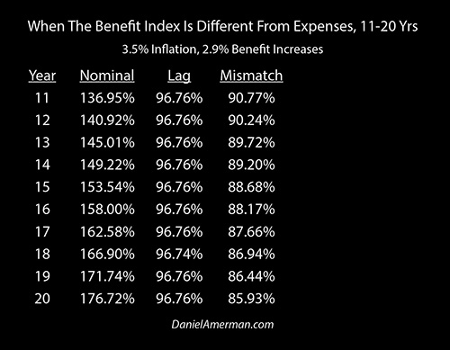
When we look at the purchasing power of benefits, year 11 starts out worse than we were in year 10 - and it just gets worse from there.
By year 13 we're down to below 90 cents on the dollar just from the inflation lags and that minor 0.60% mismatch.
By the time we get 20 years out - we're down to a little less than 86 cents on the dollar.
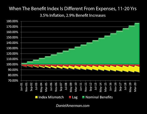
This becomes a visually obvious when we look at our benefit index graph of lost purchasing power.
Now the entire first 10 years of losses are relatively small compared to the yellow area of loss of standard of living that we see throughout the entire second 10 years.
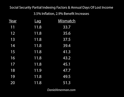
When we look at weeks of lost purchasing power, we are coming up five weeks short by year twelve, six weeks short by year sixteen, and seven weeks short by year nineteen.
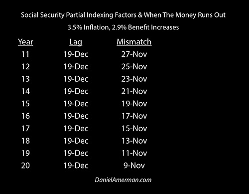
When we look at it on a calendar basis, our money has run out by the middle of November in 17 years. By the time we reach 20 years out our money is running out by November 9th of each year – just with historically average inflation and that slight 0.60% difference in the growth rates between our money coming in and our money going out.
Partial inflation indexing, which is what is being illustrated here is something which is not intuitive for most people - but yet it could be one of the most important determinants of their real world standard of living for much of their life.
The Bigger Picture
The inflation-adjusted value of Social Security payments also needs to be placed in a much broader context.
If the average retiree loses seven weeks of living expenses in 20 years - that is seven weeks of income that the federal government doesn't have to pay for tens of millions of retirees in 20 years. Which given the enormous financial problems faced by the heavily indebted United States government over the next 20 years - could be called a major "feature" from the perspective of the government.
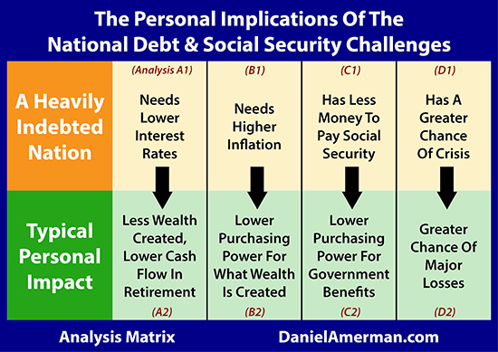
The analysis herein falls into the C2 family of analyses that can be found in the analysis matrix shown above and is linked here. Because a heavily indebted nation has less money to pay Social Security (the C1 analyses), there is an enormous incentive for it to steadily lower the purchasing power of Social Security payments over the long term, in a way that is subtle enough to avoid major political implications in any given year.
Making Better Social Security Claiming Decisions
There is also a critical relationship between the purchasing power of benefits and the decision regarding what age to begin claiming Social Security benefits. Some quite naive decision aids are in wide usage, which ignore inflation and claim a "six figure" advantage to delaying collecting benefits.
More sophisticated models usually make an assumption that Social Security is fully inflation-indexed. These models again tend to favor delaying collecting Social Security, although not the same extent as the naive models which ignore purchasing power.
However, even the most sophisticated and seemingly authoritative retirement models can be dead wrong if they assume full inflation indexing - and what we get is partial inflation indexing instead, as was examined herein.
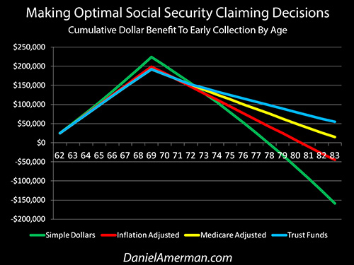
The analysis shown above and linked here examines how the Social Security claiming decision can change when we use a different form of analytical sophistication, and allow for other factors which can decrease the purchasing power of benefits over time.
Using Expected Expense Growth Rates As A Screen For Retirement Decisions
The number one determinant of your standard of living in retirement over the long term may be the difference between the growth rate of your income and the growth rate of your expenses.
As established in these first three analyses even a very small differential is sufficient to become quite material over time and even life-changing.
There is good news and bad news when it comes to these growth rates, and what was shown as the yellow area of lost purchasing power in the graphs.
The bad news is that the tendency is downward when it comes to retirees in general. Just as matter of design with how Social Security inflation indexing actually works, most retirees are likely to steadily lose purchasing power - and the federal government has overwhelming financial incentives to keep it that way, or even make it still worse by lowering the real rate of benefit increases still more.
We used reasonably conservative assumptions in this analysis. They were still sufficient to eliminate a month of Social Security income on an annual basis for the retirees of an entire nation within ten years. The number of lives that will be affected and the impact on each of these lives is extraordinary. This subtle but steadily building impoverishment needs to be on the table as matter of public policy debate and openly discussed in elections, rather than being hidden behind mathematical and indexing obscurities.
The good news is that when we understand these issues, we can make personal decisions that can potentially decrease - or even eliminate - the yellow area of purchasing power losses in our own lives.
We can do this by adding a new screen that we use for some critical retirement decisions.
This screen involves making important retirement decisions not just based upon initial budgets and expenses - but explicitly taking into account different expected expense growth rates. And as we have established in this analysis - even a very small difference in expense growth rates can have transformative effects on our quality of life in retirement over the long term, even if the initial difference is seemingly minute.
The factors that determine whether we run out of money in October or November - or late December or even January of the following year - are not something that we can entirely control, but we can at least influence what will happen to us by the choices we make, and we can possibly even completely change our personal outcomes.
We will examine how using this screen to change the size of our own "yellow areas" can powerfully impact some key retirement decisions in a later analysis.
This analysis is part of a series of related analyses, an overview of the rest of the series is linked here.
 What you have just read is an "eye-opener" financial analysis about critically important retirement decisions, and how they can change when we take a holistic look at the future.
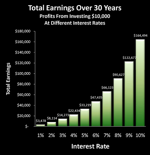
Retirement lifestyle is determined by both benefits and savings. Linked here is a related "eye-opener" that shows how the government's suppressing interest rates can reduce retirement investment wealth accumulation by 95% over thirty years, and how low interest rate policies are profoundly reducing standards of living for those already retired.
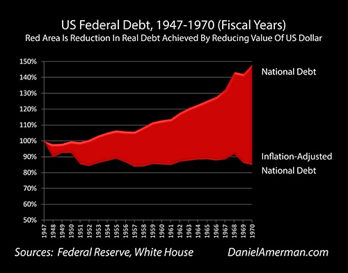
National debts have been reduced many times in many nations ─ and each time the lives of the citizens have changed. The "eye-opener" linked here reviews four traditional methods that can each change your daily life, and explores how governments use your personal savings to pay down their debts in a manner which is invisible to almost all voters.

The U.S. national debt is likely to change our daily lives in multiple ways over the coming decades, some of which are little understood by savers and investors. As shown in the first row of analyses in the matrix which is linked here, heavily indebted nations have major challenges when it comes to interest rates, inflation, financial stability and the ability to make Social Security and Medicare payments in full. As is examined in the second row of analyses, each of those national challenges can directly translate to life-changing personal challenges as well.


If you find these "eye-openers" to be interesting and useful, there is an entire free book of them available here, including many that are only in the book. The advantage to the book is that the tutorials can build on each other, so that in combination we can find ways of defending ourselves, and even learn how to position ourselves to benefit from the hidden redistributions of wealth.


